Data Missing when Plotting 2 Axes with Different x-axis Values

mnott

New Member
Joined
Jul 29, 2015
Messages
3
Hi there,
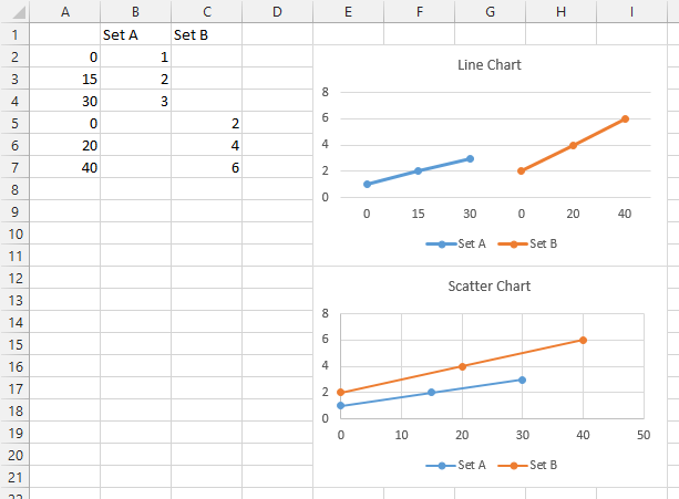
I'm currently trying to plot two different data sets on the same line graph. The x-axis is time for both, however, the time is spaced at different intervals for each. (i.e. one records a point every 15 seconds, and the other records a point every 20 sec).


My attempt at combining them has been this:


1) Put all times in one column, starting with the first set of times 0-x by 15, followed by the next set 0-y by 20.
2) Put data set 1 in the column to the right of the time column.
3) Put data set 2 in the same column directly below.


When I do this and try to plot the data on a line graph, I get all of the data points for the top set of data, but the bottom set of data gets cut off towards the end.
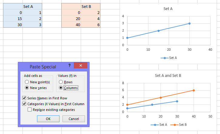

How do I fix this?


Thanks!
 

Excel Facts

Show numbers in thousands?
Use a custom number format of #,##0,K. Each comma after the final 0 will divide the displayed number by another thousand
It's not completely clear what you are trying to achieve, do you want each point on the x-axis represent two values (multiples of 15 and 20) or do you want the x axis to be a continuous time line with the corresponding y-values?
 
Upvote 0
It's not completely clear what you are trying to achieve, do you want each point on the x-axis represent two values (multiples of 15 and 20) or do you want the x axis to be a continuous time line with the corresponding y-values?

I HAVE 2 sets of y values both dependent upon the X-var: time in seconds. I WANT to plot both sets of y-values on the same graph as different series to compare the two. HOWEVER, the x-values corresponding to the two sets of y-values are at different intervals...FOR example:

In set A, the first three coordinates are (0, y1), (15, y2), and (30, y3),
In set B, the first three coordinates are (0, y4), (20, y5), and (40, y6)

How do I plot both on the same line graph?? I'm running into issues combining them.
 
Upvote 0
If you're plotting numeric X values, you should use an XY chart, because a line chart doesn't know how to treat the X values numerically.

Here's the data you just described, put into three columns as you described earlier:

MrExcel-LineVsXY.png


But in an XY chart, you don't need to mess up your data. Here is a screenshot showing the data in separate regions.

Select the blue shaded range, and insert an XY Scatter chart (top chart).

Copy the orange shaded range, select the chart, then use Paste Special from the Home tab, and use the settings in the Paste Special dialog shown below left.

The resulting chart is shown below right.

MrExcel-LineVsXY2.png
 
Upvote 0

Forum statistics

Threads
1,214,649
Messages
6,120,728
Members
448,987
Latest member
marion_davis

We've detected that you are using an adblocker.

We have a great community of people providing Excel help here, but the hosting costs are enormous. You can help keep this site running by allowing ads on MrExcel.com.
Allow Ads at MrExcel

Which adblocker are you using?

Disable AdBlock

Follow these easy steps to disable AdBlock

1)Click on the icon in the browser’s toolbar.
2)Click on the icon in the browser’s toolbar.
2)Click on the "Pause on this site" option.
Go back

Disable AdBlock Plus

Follow these easy steps to disable AdBlock Plus

1)Click on the icon in the browser’s toolbar.
2)Click on the toggle to disable it for "mrexcel.com".
Go back

Disable uBlock Origin

Follow these easy steps to disable uBlock Origin

1)Click on the icon in the browser’s toolbar.
2)Click on the "Power" button.
3)Click on the "Refresh" button.
Go back

Disable uBlock

Follow these easy steps to disable uBlock

1)Click on the icon in the browser’s toolbar.
2)Click on the "Power" button.
3)Click on the "Refresh" button.
Go back
Back
Top