Chart Connect Points Drawing Shapes Peltier

doriangrey

Board Regular
Joined
Jan 18, 2012
Messages
57
Excel Vba Shapes to Connect Points Charts and make Drawing Clone of Complex Chart XY with Lines


Hi, Partners,
I using Jhon Peltier code to draw in charts,


I want connect the point of chart XY to create a shape clone of chart of 2 ways, 1solid line shape and 1Outline Shape.


the code works with more simplex charts but no with my complex chart.
i need change your "Dim as Integer" to "Dim as Long" to works with more simplex.


i need change the location of "Next" before "ConverToShape" to final of code to avoid the problem of shape close before a correct moment.


https://groups.google.com/forum/#!searchin/microsoft.public.excel.charting/nodes$20points%7Csort:relevance/microsoft.public.excel.charting/AgWMOIKU4Do/w1JYa3PIt5kJ


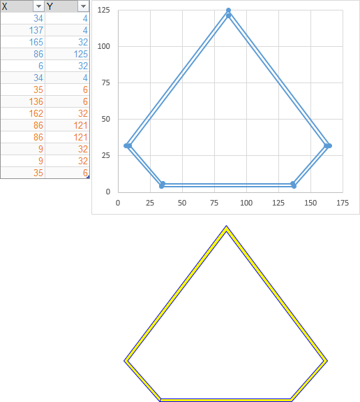
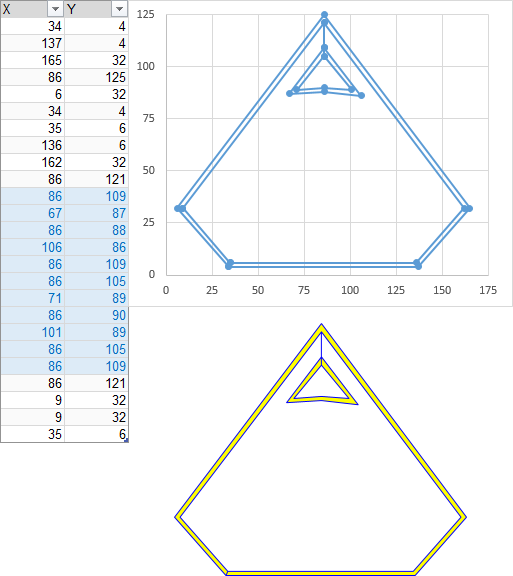
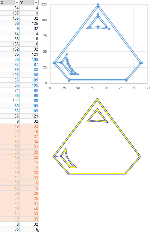
the chart (XY Scatter dots only) have 1series with very number of points with contiguous and non-contiguous points complex design.


Excel 2013 32bit Original - Win7.


please work with my sample file logo if possible.

https://mega.nz/#!RxRV0QSR!uHzNTAOIbzJqyN3igXlGxxbSxlKrR2xV1XlQ_h2IxVk

Code:
[COLOR=#333333][FONT=source_sans_proregular]https://mega.nz/#!RxRV0QSR!uHzNTAOIbzJqyN3igXlGxxbSxlKrR2xV1XlQ_h2IxVk
[/FONT][/COLOR]


thank you very mutch.
DorianGrey


Excel Facts

Highlight Duplicates
Home, Conditional Formatting, Highlight Cells, Duplicate records, OK to add pink formatting to any duplicates in selected range.
I should note that the code sample you have found is 15 years ago. I'm surprised it's still floating around, but I guess Google never forgets. I'll repeat the code at the bottom of this post.

The Integer variables would be better declared as Longs, for multiple reasons. This is the only change I've made to the code.

Also, the "Next" does in fact come before "ConvertToShape" in that ancient code.

I wrote the above while waiting for the file to download. Now for the specifics about your file.

Note that the chart on sheet SheetX1simply includes some blank cells (the data stops at row 25, but the chart series goes down to row 32). This leads to the line segment that reaches to (0,0). Excel won't plot a point there, but the VBA code still uses the data for the shape it draws. When you fix the data, the drawing of the "X" is perfect.

Your chart with the Superman logo has the same problem with blank cells. The data starts at row 2 and ends at row 2488, but the chart series uses all million-plus cells in each column.

Then, the points for some reason don't trace the outline of the shape, instead they go back and forth across the chart. It's like the points are there, but they are sorted by Y value instead of by position around the outline.

What you need to do is order the points so they go around the shape. You don't need a point every unit if they are all on a straight line, just points at the ends of each line segment. Then build it up in pieces.

Here is piece 1, the outermost outline of the logo. I've put the data into a Table, because I find it easier to work with the points that way. The cells with blue text are points on the outer edge of the figure, and the cells with orange text are on the inner edge. I ran the code, then cut the resulting shape and pasted it below the chart. The shape has an extra blue line in the bottom left corner, where I started and ended the shape. That doesn't matter, because you're going to only use the fill color of the shape, and use no border.

vwhcvLS.png


I used my original code (bottom of the post) to draw this, by the way.

Then I looked at the triangular cut out at the bottom of the logo (at the top of my chart, because that's how your data was set up). I inserted the new points (shaded blue) at the appropriate place, and you see the line connecting markers from the original outline to the outline of the cutout. The new shape has the original outline and the cutout, and it has some extra border segments connecting these regions. But again, if you hide the border and only use the fill, it'll be cool.

HSKJ3ki.png


I repeated this for the cutout at the top right of the logo (the bottom left of the inverted chart), this time shaded orange.

8uovn8t.png


Three more cutouts and you have yourself a logo, at least one of the colors. You can adjust the positions of the points, and even add more if you need a smoother arc around the "S". When it's perfect, run the code.

Repeat this protocol for each of the colors in your logo, then draw and line up the shapes.

Code:
Sub DrawAShape()
  Dim myCht As Chart
  Dim mySrs As Series
  Dim Npts As Long, Ipts As Long
  Dim myBuilder As FreeformBuilder
  Dim myShape As Shape
  Dim Xnode As Double, Ynode As Double
  Dim Xmin As Double, Xmax As Double
  Dim Ymin As Double, Ymax As Double
  Dim Xleft As Double, Ytop As Double
  Dim Xwidth As Double, Yheight As Double

  Set myCht = ActiveChart
  Xleft = myCht.PlotArea.InsideLeft
  Xwidth = myCht.PlotArea.InsideWidth
  Ytop = myCht.PlotArea.InsideTop
  Yheight = myCht.PlotArea.InsideHeight
  Xmin = myCht.Axes(1).MinimumScale
  Xmax = myCht.Axes(1).MaximumScale
  Ymin = myCht.Axes(2).MinimumScale
  Ymax = myCht.Axes(2).MaximumScale

  Set mySrs = myCht.SeriesCollection(1)
  Npts = mySrs.Points.Count

  Xnode = Xleft + mySrs.XValues(Npts) * Xwidth / (Xmax - Xmin)
  Ynode = Ytop + (Ymax - mySrs.Values(Npts)) * Yheight / (Ymax - Ymin)

  Set myBuilder = myCht.Shapes.BuildFreeform(msoEditingAuto, Xnode, Ynode)
  For Ipts = 1 To Npts
    Xnode = Xleft + mySrs.XValues(Ipts) * Xwidth / (Xmax - Xmin)
    Ynode = Ytop + (Ymax - mySrs.Values(Ipts)) * Yheight / (Ymax - Ymin)
    myBuilder.AddNodes msoSegmentLine, msoEditingAuto, Xnode, Ynode
  Next
  Set myShape = myBuilder.ConvertToShape

  With myShape
    ' USE YOUR FAVORITE COLORS HERE
    .Fill.ForeColor.SchemeColor = 13  ' YELLOW
    .Line.ForeColor.SchemeColor = 12  ' BLUE
  End With

End Sub
I am getting "value out of range" error with .Fill.Forecolor.Schemecolor = 13.
 
Upvote 0
I am getting "value out of range" error with .Fill.Forecolor.Schemecolor = 13.
I ran the code on a new XY Scatter chart, and it worked as expected without any errors. What do your data and chart look like?
 
Upvote 0
I ran the code on a new XY Scatter chart, and it worked as expected without any errors. What do your data and chart look like?
Thank you Jon. I am switching strategies and will use gnuplot controlled from VBA.
 
Upvote 0

Forum statistics

Threads
1,214,523
Messages
6,120,042
Members
448,940
Latest member
mdusw

We've detected that you are using an adblocker.

We have a great community of people providing Excel help here, but the hosting costs are enormous. You can help keep this site running by allowing ads on MrExcel.com.
Allow Ads at MrExcel

Which adblocker are you using?

Disable AdBlock

Follow these easy steps to disable AdBlock

1)Click on the icon in the browser’s toolbar.
2)Click on the icon in the browser’s toolbar.
2)Click on the "Pause on this site" option.
Go back

Disable AdBlock Plus

Follow these easy steps to disable AdBlock Plus

1)Click on the icon in the browser’s toolbar.
2)Click on the toggle to disable it for "mrexcel.com".
Go back

Disable uBlock Origin

Follow these easy steps to disable uBlock Origin

1)Click on the icon in the browser’s toolbar.
2)Click on the "Power" button.
3)Click on the "Refresh" button.
Go back

Disable uBlock

Follow these easy steps to disable uBlock

1)Click on the icon in the browser’s toolbar.
2)Click on the "Power" button.
3)Click on the "Refresh" button.
Go back
Back
Top