
Stem & Leaf Plots
Challenge for for January 2007: Stem & Leaf Plots in Excel
Stem & Leaf charts gained popularity in the 1980’s. I don’t remember them from school, but my kids have to do them every year in math class. A quick review of Google shows CMalone saying “To my knowledge, Excel does not do stem-and-leaf plots. If you discover that Excel can do stem-and-leaf displays, please send an email”. All you have to do is walk into a room full of Excel enthusiasts and say something can’t be done and the game is on.
I have three methods below, but they all seem a bit kludgey. For the January 2007 challenge, try to find a better way to create a stem and leaf plot. The prize is TBD and will be awarded to the best non-VBA solution to the problem.
Quick Definition of a Stem & Leaf Chart
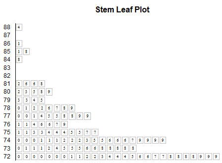
Consider the 25 values in A2:E6. They would create the stem and leaf plot shown in G2:H6. The chart shows that in the 30’s, there is one value; 39. In the 40’s, there are five values; 41, 44, 46, 48, and 48. The 60’s have the most values.
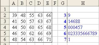
The leaves in column H need to be sorted in ascending order. I’ve put the original numbers in a 5×5 matrix to keep the screen shot small. In reality, you would really have those running down A2:A26.
Less than Optimal Solution #1:
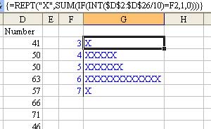
Some sites on the Internet replaces the digits in the leaf portion of the display with X’s. If you were allowed to make this simplification, then an array formula would generate the leaves for each stem:
Really Long Formula Solution #2:
This solution uses an insanely long formula.
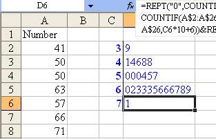
Here is the formula in D2:
=REPT(“0”,COUNTIF(A$2:A$26,C2*10+0))&REPT(“1”,COUNTIF(A$2:A$26,C2*10+1))
&REPT(“2”,COUNTIF(A$2:A$26,C2*10+2))&REPT(“3”,COUNTIF(A$2:A$26,C2*10+3))
&REPT(“4”,COUNTIF(A$2:A$26,C2*10+4))&REPT(“5”,COUNTIF(A$2:A$26,C2*10+5))
&REPT(“6”,COUNTIF(A$2:A$26,C2*10+6))&REPT(“7”,COUNTIF(A$2:A$26,C2*10+7))
&REPT(“8”,COUNTIF(A$2:A$26,C2*10+8))&REPT(“9”,COUNTIF(A$2:A$26,C2*10+9))
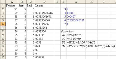
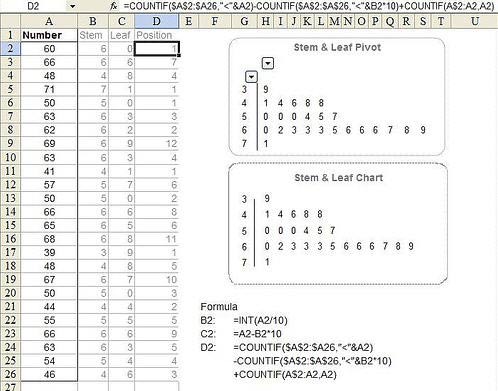
Have to Sort & Use Formulas Solution #3:
This solution requires that the data be sorted in descending sequence. New formulas in B, C, & D break the original numbers out into Stem, Leaf, and Leaves. VLOOKUPS in G then bring the leaves into the chart.
So – the challenge/discussion topic for January 2007 – is there a more elegant way to create stem and leaf plots? As an added twist, the problem on this page is fairly basic. Some charts such as this chart from Wikipedia use “88|4″ to represent 8848 meters.
Results
Most answers to this challenge were posted in the message board. Oaktree was the first to answer the challenge, 40 minutes after it was posted, using functions from the MOREFUNC add-in. Markyc came along a few days later with the shortest formula using MoreFunc; {=MCONCAT(REPT(ROW($1:$10)-1,COUNTIF(A$8:A$32,G2*10+ROW($1:$10)-1)))} . Oaktree argues that most people should have MoreFunc installed, and while most people reading this site might have it installed, I bet that most people using Excel in general don’t have it installed.
Northwolves was the first to post a straight Excel formula to solve the problem: =REPT(0,COUNTIF(A$8:A$32,G2*10)) & SUMPRODUCT(ROW($1:$9)*(10^COUNTIF(A$8:A$32,G2*10+ROW($1:$9))-1)*10^(COUNTIF(A$8:A$32,”>”&G2*10+ROW($1:$9))+MATCH(G2*10+9,A$8:A$32)-26)/9). Other working formulas were submitted by xld, meng132, riteshparakh, F1A1G1inDC, cgordon, cmpvjones, jg1980, hady, hjk, Domenic, and liyong. jg1980 used the FREQUENCY function, and then Hady simplified into the shortest formula entered.
DougJ’s circular reference solution is unique.
Pivot tables were suggested by Bman-Belgium, and fractaloon. Fractaloon’s pivot chart looks cool and gets points for using Excel’s most powerful feature. However, my son’s middle school math teacher would say that this is not a stem and leaf plot.
roger2 suggested using a data table.
twinetwstr built a hidden workspace to simplify the problem for the person using the spreadsheet.
Two people were able to create actual charts that looked like stem and leaf plots. On January 5, Andy Pope sent his entry in via e-mail. It creates a stacked bar with a custom fill:
On January 12, Excelli produced an actual chart that looked like a stem and leaf plot using an XY chart. This was the first entry that evoked a positive reaction from someone else. It is a great looking stem and leaf plot:
These last two examples are surprising, since I didn’t think anyone would be able to actually create a real chart with the answer. I am going to say that first prize goes to Andy and Excelli. They can choose any bundle from the MrExcel store.
For second prize, I am declaring a 19-way tie between Oaktree, Markyc, Northwolves, xld, meng132, riteshparakh, F1A1G1inDC, cgordon, cmpvjones, jg1980, hady, hjk, Domenic, liyong, DougJ, BMan-Belgium, fractaloon, roger2, and twinetwstr. You can choose 1 title from any of the items published by Holy Macro! Books in the MrExcel store. Drop a note to bill at mrexcel.com. (If you are outside of the U.S., and choose an e-book, just give me your e-mail. Otherwise, provide a postal address.)
Thanks to everyone who entered. I will have to drop professor Malone a note saying that there are at least 21 ways of creating stem and leaf plots!