
Charting Tips
January 21, 2005
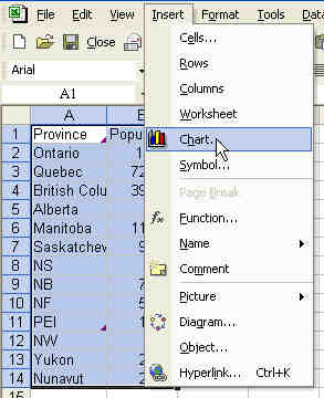
Creating Charts in Excel is easy. The first demo is how to create a pie chart. Select your data. You should have category names in column A and headings in row 1. From the menu, select Insert - Chart.
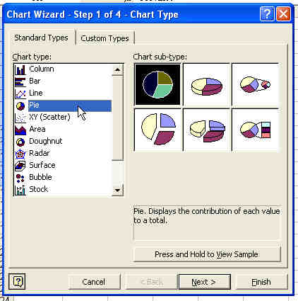
Select Pie from the Chart types listbox. Choose one of the six standard pie charts.
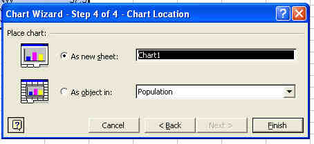
Click Next until you get to step 4. In step 4, you can specify that the chart should go on a new sheet.
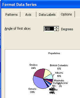
Many things on a chart can be customized. Right-click the pie and choose Format Data Series.

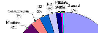
On the Data Labels tab, you can add the Category Name and Percentage.

If you have data labels that are crashing into each other, sometimes changing the angle of the pie chart can solve the problem. Right-click the pie and choose Format Data Series again. This time, on the Options tab, increase the Angle of First Slice to 150 degrees. This gets the smallest pie slices in the lower right corner.
Donut Charts
Pie Charts can only show one series of data. If you have two series of data to show, use a Donut Chart.
Create a Chart with One Click
Highlight your data including headings. Hit the F11 key to create the default chart.
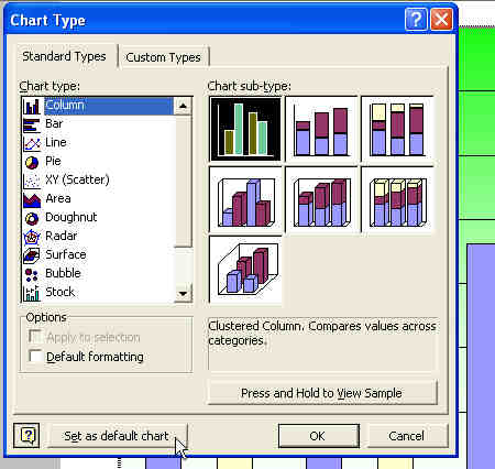
Change the default Chart type used with F11
To change if you get a pie or a bar chart with the F11 key, first make a chart with the proper settings. Highlight the chart. From the menu, select Chart - Chart Type. In the lower left corner of the dialog, choose "Set as Default Type".
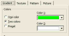
Fill Effects
Instead of the boring grey background in charts, you can create cool gradients.
To create a gradient, right-click in the middle of nothing in the chart. Select Format Plot Area. Choose the Fill Effects Button.

Set up a two-color gradient on the Fill Effects tab.
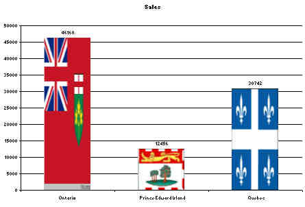
The last trick in the segment was replacing a single bar with a picture. To do this, you first left click on a bar. Then, wait, and do a second single click on the bar. This will select just one data point. Right click on the bar and select Format Data Point. On the fill effects tab, choose a picture. Browse for a picture for that bar. Indicate if you want it to be stretched or stacked. Repeat for each bar. The result: a chart with flags instead of bars.