Jyggalag

Active Member
Joined
Mar 8, 2021
Messages
422
Office Version
  1. 365
  2. 2019
Platform
  1. Windows
Hi all,

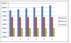
I currently have this graph:

1665494392494.png


I don't really care about the light and dark orange columns, but I need them to stay nonetheless.

However, the grey chart rises from a value of about 9300 to 10500 doing this period, which is not that noticeable in this chart to be honest. I would like to make this change seem visually large, but am unsure of how to do this.

Does anybody have experience with this or ideas for how it could be done? Would be greatly appreciated!

Thank you all :)

Kind regards,
Jyggalag
 

Excel Facts

Remove leading & trailing spaces
Save as CSV to remove all leading and trailing spaces. It is faster than using TRIM().
This is one idea I have so far, but it does not seem to make a massive difference:
1665495496327.png
 
Upvote 0
The "standard" way to deceive with these sorts of graphs is to change the vertical axis so that it doesn't start at zero. To do this select the chart, chart tools format, then select vertical (value) axis, format selection, uncheck automatic and put a vlaue such a 3000 as the start point:
Format axis.JPG
 

Attachments

  • Graph deception.JPG
    Graph deception.JPG
    33.6 KB · Views: 5
Upvote 0
Solution
May I ask why? That would seem misleading on the face of it.
It's a fictional scenario for festival tickets with two remaining static due to not offering refunds and the other one increasing like this :) I was just wondering how you could slight increases seem larger as i'm currently building a large dashboard of template graphs that do all sorts of things

@offthelip this makes sense! thank you so much!
 
Upvote 0
Then I would not use a column chart since the whole point of them is that the height of the column represents the actual value.
 
Upvote 0
Then I would not use a column chart since the whole point of them is that the height of the column represents the actual value.
Ah yes that was also what I was thinking to some extent. I was considering maybe some sort of line chart showing the percentile increase for each of them.

However the issue with such a chart would be that obviously only one of them has a percentile increase, so the other two would just be a flat line at 0% all the way - if that makes sense?
 
Upvote 0
I would say that your chart in post 2 is probably the best representation. It makes clear that there is an increase without distorting the actual data.
 
Upvote 0
I would say that your chart in post 2 is probably the best representation. It makes clear that there is an increase without distorting the actual data.
Gotcha, was also feeling a bit optimistic about it, but mostly due to the straight line, because otherwise looking at the columns visually it does not look like the grey one is increasing at all :)
 
Upvote 0

Forum statistics

Threads
1,215,430
Messages
6,124,852
Members
449,194
Latest member
HellScout

We've detected that you are using an adblocker.

We have a great community of people providing Excel help here, but the hosting costs are enormous. You can help keep this site running by allowing ads on MrExcel.com.
Allow Ads at MrExcel

Which adblocker are you using?

Disable AdBlock

Follow these easy steps to disable AdBlock

1)Click on the icon in the browser’s toolbar.
2)Click on the icon in the browser’s toolbar.
2)Click on the "Pause on this site" option.
Go back

Disable AdBlock Plus

Follow these easy steps to disable AdBlock Plus

1)Click on the icon in the browser’s toolbar.
2)Click on the toggle to disable it for "mrexcel.com".
Go back

Disable uBlock Origin

Follow these easy steps to disable uBlock Origin

1)Click on the icon in the browser’s toolbar.
2)Click on the "Power" button.
3)Click on the "Refresh" button.
Go back

Disable uBlock

Follow these easy steps to disable uBlock

1)Click on the icon in the browser’s toolbar.
2)Click on the "Power" button.
3)Click on the "Refresh" button.
Go back
Back
Top