using data to create the series label in Excel on X Y Scatter

ciccio2021

New Member
Joined
May 19, 2021
Messages
1
Office Version
  1. 2019
Platform
  1. Windows
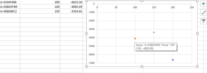
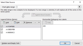
I’m trying to use the data (see images below) to have three data points for each dot on the scatter diagram.
I need each series element to be custom selected data (not fixed label) so that when I hover over the dot all three data points are visible.
I can do this manually; however, I want to do it for 200 data points. Is there a way to automate or import data into a scatter diagram to achieve what I’m trying to do?
Thanks
 

Attachments

  • image 2.png
    image 2.png
    15.7 KB · Views: 21
  • image1.png
    image1.png
    16 KB · Views: 19

Excel Facts

How to change case of text in Excel?
Use =UPPER() for upper case, =LOWER() for lower case, and =PROPER() for proper case. PROPER won't capitalize second c in Mccartney

Forum statistics

Threads
1,215,376
Messages
6,124,593
Members
449,174
Latest member
chandan4057

We've detected that you are using an adblocker.

We have a great community of people providing Excel help here, but the hosting costs are enormous. You can help keep this site running by allowing ads on MrExcel.com.
Allow Ads at MrExcel

Which adblocker are you using?

Disable AdBlock

Follow these easy steps to disable AdBlock

1)Click on the icon in the browser’s toolbar.
2)Click on the icon in the browser’s toolbar.
2)Click on the "Pause on this site" option.
Go back

Disable AdBlock Plus

Follow these easy steps to disable AdBlock Plus

1)Click on the icon in the browser’s toolbar.
2)Click on the toggle to disable it for "mrexcel.com".
Go back

Disable uBlock Origin

Follow these easy steps to disable uBlock Origin

1)Click on the icon in the browser’s toolbar.
2)Click on the "Power" button.
3)Click on the "Refresh" button.
Go back

Disable uBlock

Follow these easy steps to disable uBlock

1)Click on the icon in the browser’s toolbar.
2)Click on the "Power" button.
3)Click on the "Refresh" button.
Go back
Back
Top