Charting in Excel 365

sfos83

New Member
Joined
Mar 2, 2021
Messages
10
Office Version
  1. 2016
Platform
  1. Windows
Hi All,

Essentially, what I'm doing is very basic, but after multiple tutorials and trial-and-error, it eludes me. (my hair is beginning to fall out after 3 days of trying to create one simple chart)

I have 3 columns of data:

1. Date
2. Arrived (arrival time of an email into outlook) ) (SERIES 1)
3. Cutoff (latest time that the email should arrive) (SERIES 2)

1653892466856.png


I'm trying to chart the arrival of emails as they come in each day, and for the chart to accommodate the new data as a new day ticks over.
You can see that the 27th May is now blank, but as the email arrives, the cells have Vlookups which populate data in the 'Arrived' and 'Cutoff' columns.

My major issue is that Excel 365 does not seem to know how to treat series vs axes.
I'd like to have date on the x-axis and time on the y-axis, with the two series Arrival and Cutoff charted against each other - but it's never that simple with Excel.
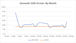
Desired:
1653893366789.png


Further, I understand that dynamic charting requires named ranges that expand when a new date is added, but I cannot get that far, as no matter what columns I select, the chart is different every time.
Sometimes it even treats each time point as its own series, leading to 20+series per month! (screenshot)

For example, If I only select data in columns Arrival and Cutoff and insert chart, I get this:

1653892428966.png


Other times, selecting all 3 columns (Date, Arrival, Cutoff) will yield a good-looking chart, but include dates on the x-axis that are not in the range!
being Excel 365, you cannot link the min/max x-axis values with a formula.


1653892599672.png


I've tried converting the times to decimals and working like that, but as soon as you change the axis category to time, it turns the y-axis all to 12:00:00PM (screenshot)

1653893109647.png
1653893116008.png


Any help/links to tutorials working with time series would be greatly appreciated legends!

Steve
 

Attachments

  • 1653892572696.png
    1653892572696.png
    18.6 KB · Views: 9

Excel Facts

Can you sort left to right?
To sort left-to-right, use the Sort dialog box. Click Options. Choose "Sort left to right"
Seems you are after something like this:
1653912554215.png

It's simple Excel charting. You only have 2 series, arrived and latest. x-Axis is a date axis.

Dynamic ranges on the chart are used like this.
1653912897268.png

Formulas for reference:
Book1
KLMNOPQRSTU
1
2DateArrivedLatestrDatesrArrivedrLatest
32/05/20229:308:002/05/20229:308:00
43/05/20228:398:003/05/20228:398:00
54/05/20227:308:004/05/20227:308:00
65/05/20227:158:005/05/20227:158:00
76/05/20228:128:006/05/20228:128:00
89/05/20226:128:009/05/20226:128:00
910/05/20228:198:0010/05/20228:198:00
10
11
12
13rDates=$K$3:INDEX($K3:$K360;COUNTA($K3:$K360))
14rArrived=$L$3:INDEX($L3:$L360;COUNTA($L3:$L360))
15rLatest=$M$3:INDEX($M3:$M360;COUNTA($M3:$M360))
16
Sheet1
Cell Formulas
RangeFormula
O3:O9O3=$K$3:INDEX($K3:$K360,COUNTA($K3:$K360))
P3:P9P3=$L$3:INDEX($L3:$L360,COUNTA($L3:$L360))
Q3:Q9Q3=$M$3:INDEX($M3:$M360,COUNTA($M3:$M360))
O13:O15O13=TRANSPOSE(O2:Q2)
P13:P15P13=TRANSPOSE(FORMULATEXT(O3:Q3))
Dynamic array formulas.


Y-Axis definition:
1653913100093.png


For charting tutorials: 1 address to start from is @Jon Peltier at Jon's Excel Page
 
Upvote 0
When you have dates in the first column and other values in other columns, Excel uses dates as X values and the other values as Y values. But if your other values are also dates or times, Excel gets confused. Here's how to get around it and also make the chart dynamic.

Here is my data. I have selected it and converted it into a Table. I used the Ctrl+T shortcut, but you could Format as a Table on the Home tab or Insert Table on the Insert tab. The Table is a special range with data features built in.

Select the Arrived and Latest columns (including header) and insert a line chart (Chart 1). Since you have not specified X values, Excel plots the point number (1, 2, 3,...).

Select one of the series. The SERIES formula looks like this:

Excel Formula:
=SERIES(Sheet1!$C$2,,Sheet1!$C$3:$C$13,1)

Put the cursor between the two commas, which is where the X values should be specified, select the dates (not including the header), and click Enter. The formula changes to this, and the chart now shows dates (Chart 2).

Excel Formula:
=SERIES(Sheet1!$C$2,Sheet1!$B$3:$B$13,Sheet1!$C$3:$C$13,1)

DynamicChartDateVsTime.png


If you don't want to show weekends, double-click on the X-axis, and under Axis Type, choose Text Axis.

When you get another day's data, enter the date and the two times in the next row below the Table. The Table detects the new data and expands, and at the same time, the chart expands to include the new Table row.
 
Upvote 0
Hi G,

A thousand thankyous! My organisation only has Excel 2016 desktop or Excel online, so unfortunately the above does not apply to me - however, I have requested installation of the new version and I'll put your advice into action.

Cheers, Steve
 
Upvote 0
Hi Jon,

Also super helpful stuff!

As per my other post, I'll need Excel 365 desktop I imagine - the Excel online version doesn't have the SERIES function.
If my organisation grants a licence, I'll let you know how it goes

Thanks again
Steve


When you have dates in the first column and other values in other columns, Excel uses dates as X values and the other values as Y values. But if your other values are also dates or times, Excel gets confused. Here's how to get around it and also make the chart dynamic.

Here is my data. I have selected it and converted it into a Table. I used the Ctrl+T shortcut, but you could Format as a Table on the Home tab or Insert Table on the Insert tab. The Table is a special range with data features built in.

Select the Arrived and Latest columns (including header) and insert a line chart (Chart 1). Since you have not specified X values, Excel plots the point number (1, 2, 3,...).

Select one of the series. The SERIES formula looks like this:

Excel Formula:
=SERIES(Sheet1!$C$2,,Sheet1!$C$3:$C$13,1)

Put the cursor between the two commas, which is where the X values should be specified, select the dates (not including the header), and click Enter. The formula changes to this, and the chart now shows dates (Chart 2).

Excel Formula:
=SERIES(Sheet1!$C$2,Sheet1!$B$3:$B$13,Sheet1!$C$3:$C$13,1)

View attachment 65932

If you don't want to show weekends, double-click on the X-axis, and under Axis Type, choose Text Axis.

When you get another day's data, enter the date and the two times in the next row below the Table. The Table detects the new data and expands, and at the same time, the chart expands to include the new Table row.
 
Upvote 0
Hi G,

A thousand thankyous! My organisation only has Excel 2016 desktop or Excel online, so unfortunately the above does not apply to me - however, I have requested installation of the new version and I'll put your advice into action.

Cheers, Steve
Glad to help. My solution does work on 2016 too. The dynamic ranges made with index, like rDates, inside the name manager even work on very old versions. You do not need them on the sheet, that was just to showcase.
 
Upvote 0
All suggestions made here work in Excel versions going back to Excel 2003 for Tables (they were called "Lists" back then) and even earlier for Names.

Excel for the Web doesn't have the ability to edit series names (yet), but it's coming along.
 
Upvote 0

Forum statistics

Threads
1,215,064
Messages
6,122,942
Members
449,094
Latest member
teemeren

We've detected that you are using an adblocker.

We have a great community of people providing Excel help here, but the hosting costs are enormous. You can help keep this site running by allowing ads on MrExcel.com.
Allow Ads at MrExcel

Which adblocker are you using?

Disable AdBlock

Follow these easy steps to disable AdBlock

1)Click on the icon in the browser’s toolbar.
2)Click on the icon in the browser’s toolbar.
2)Click on the "Pause on this site" option.
Go back

Disable AdBlock Plus

Follow these easy steps to disable AdBlock Plus

1)Click on the icon in the browser’s toolbar.
2)Click on the toggle to disable it for "mrexcel.com".
Go back

Disable uBlock Origin

Follow these easy steps to disable uBlock Origin

1)Click on the icon in the browser’s toolbar.
2)Click on the "Power" button.
3)Click on the "Refresh" button.
Go back

Disable uBlock

Follow these easy steps to disable uBlock

1)Click on the icon in the browser’s toolbar.
2)Click on the "Power" button.
3)Click on the "Refresh" button.
Go back
Back
Top