How To Change Bubble Chart Color Based On Categories In Excel

Aroop

New Member
Joined
Mar 12, 2015
Messages
21
Hi Will need help on how can i change color of my Bubble Chart in excel based on certain categories
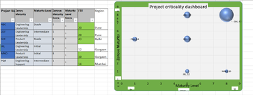
I have created Bubble Chart based on 3 criteria - Project Maturity Score, Project maturity level score & Project Team Size
Now i want to add different color to Bubble based on Region & if it can be updated dynamically for any changes in future
Attached is a sample data for your reference in actual we will have huge list of projects so manual colour will not be possible for me

Thanks in Advance
Aroop Srivastava
 

Attachments

  • Sample Data1.png
    Sample Data1.png
    90.1 KB · Views: 13

Excel Facts

Copy a format multiple times
Select a formatted range. Double-click the Format Painter (left side of Home tab). You can paste formatting multiple times. Esc to stop

Forum statistics

Threads
1,215,416
Messages
6,124,772
Members
449,187
Latest member
hermansoa

We've detected that you are using an adblocker.

We have a great community of people providing Excel help here, but the hosting costs are enormous. You can help keep this site running by allowing ads on MrExcel.com.
Allow Ads at MrExcel

Which adblocker are you using?

Disable AdBlock

Follow these easy steps to disable AdBlock

1)Click on the icon in the browser’s toolbar.
2)Click on the icon in the browser’s toolbar.
2)Click on the "Pause on this site" option.
Go back

Disable AdBlock Plus

Follow these easy steps to disable AdBlock Plus

1)Click on the icon in the browser’s toolbar.
2)Click on the toggle to disable it for "mrexcel.com".
Go back

Disable uBlock Origin

Follow these easy steps to disable uBlock Origin

1)Click on the icon in the browser’s toolbar.
2)Click on the "Power" button.
3)Click on the "Refresh" button.
Go back

Disable uBlock

Follow these easy steps to disable uBlock

1)Click on the icon in the browser’s toolbar.
2)Click on the "Power" button.
3)Click on the "Refresh" button.
Go back
Back
Top