Create a chart and a relationship when formula of y and x-axis = 1

Jarke

Board Regular
Joined
Aug 13, 2016
Messages
95
Hi!

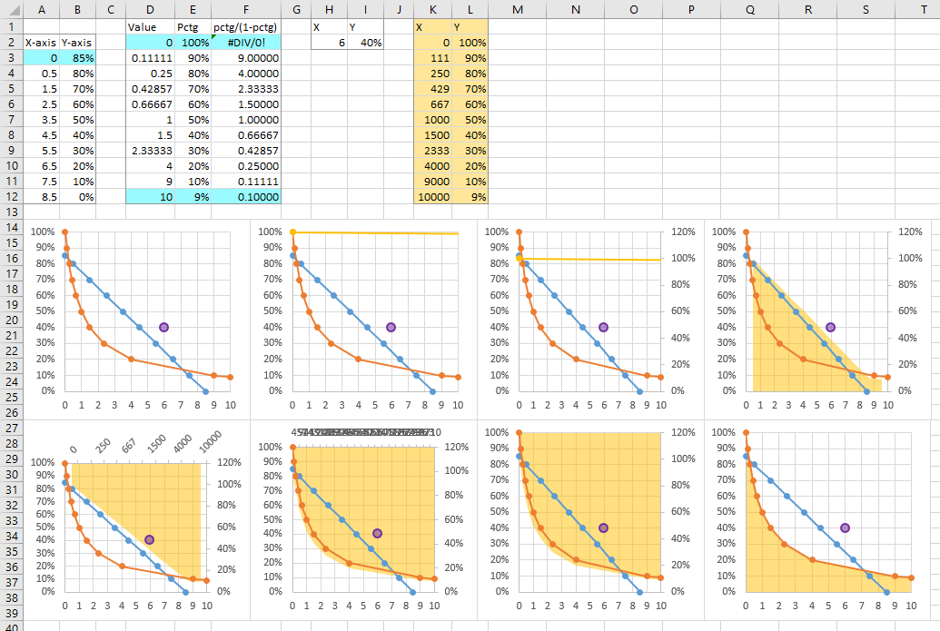
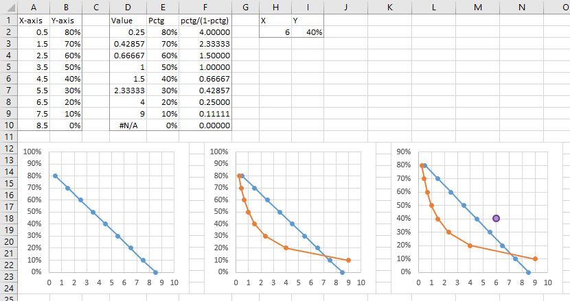
So i want to create a chart, where y-axis equal the percentage and the x-axis equal a number. And then a curvey line that shows the relationship of the two where the formula =1.

Y-axis X-axis
80% 0,5
70% 1,5
60% 2,5
50% 3,5
40% 4,5
30% 5,5
20% 6,5
10% 7,5
0% 8,5

0% and 0,5 in origo.

Now i want to find a value where the result equals 1. The formula is; =(value*percentage)/(1-percantage)

I have a picture that shows everything, just don't know how to add it in this forum....

For en example: =(1,5*0,4)/(1-0,4)=1 And i want this relationship so that i get a curvey line on the chart that shows me where the relationship = 1.

It should show something like this, look at the dots:

[.
[ .
[--.
[----.
[------ .
[_______*_'___


How do i create this and find the value on each to show where the relationship is 1 throughout the chart and numbers?

Thanks alot
 
Last edited:

Excel Facts

How can you automate Excel?
Press Alt+F11 from Windows Excel to open the Visual Basic for Applications (VBA) editor.
If the Y-axis and X-axis labels are in A1 and B1 and 0.8 and 0.5 are in A2 and B2 then the following in C2 will give a value of 0.25
=(1-A2)/A2
The following in D2 =(C2*A2)/(1-A2) will give a value of 1 [your formula =(value*percentage)/(1-percantage)]
Copy C2 and D2 down to C9 D9 and this will give you a value of 1 in cells D2:D9
Does this give you the answer you are looking for in C2:C9?
 
Upvote 0
Yes it did! Thank you alot.
I have managed to create the chart in the way that i have so beautiful illustrated above. So i got percentage in y axis and numbers in x axis, and the curved line in the chart.

My next question is this: I want to add a dot on that chart, and i want it to be placed given two values that i choose. One value for the y-axis and one for x-axis. So for an example:

My values are; "40%" and "3". This will put my dot above the curved line. (This is probably veeery simple to do).

But how do i do this?

Thanks alot, best regards
 
Upvote 0
So I suggest making your whole worksheet a bit neater.

First, put your X in the first column of your data, and your Y in the second. When you create a chart, select the total range, insert an XY chart, and Excel figures out X and Y for you. Much easier. The data in columns A and B of my screenshot becomes the first chart.

I've duplicated the percentages from column B in column E. Cell F2 contains this formula, which is copied down to F10:

=B2/(1-B2)

Cell D2 contains this formula, copied down to D10:

=IF(F2=0,NA(),1/F2)

The IF prevents a #DIV/0! error, instead giving the equally ugly #N/A error which nonetheless won't mess up the chart.

I copied the data in columns D and E, selected the chart, and used Paste Special to add the data as new series, data in columns, series names in first row, categories (X values) in first column. That produces my second chart.

Finally I set up the range H1:I2 to contain arbitrary X-Y data that you want to plot. Like before, copy this range, select the chart, use Paste Special to add the data as new series, data in columns, series names in first row, categories (X values) in first column. That produces my third chart. Changing the X and Y values in H2 and I2 will cause the point to move.

8CgHxDN.png
 
Upvote 0
Thank you Jon for excellent answer! It works perfectly.

Hopefully you can help me with one more thing, i have done exactly as you have, but have just made the blue line invisible. I would like to make the area beneath/behind the curved line red and above it green. How do i do this? Much appreciate a clear explanation for a novice like me :) .

Thanks again, best regards
 
Upvote 0
Jarke -

Did you intentionally make the blue line invisible? If you want to get it back, select the other line and use the up and down arrow keys until it is selected, then press Ctrl+1 (numeral one) to format the series, and give it a visible line color.

Aside from one thing, I'll show how to create fill colors in the chart. That one thing is that red and green are a bad combination of colors. I know that red means bad and green means good, but I also know that about 8.5% of the male population experiences deficiencies in color vision, and the most common color vision deficiency is an inability to distinguish red from green. So I'll just color the region below the curved line yellow and leave the background as it was.

This is an application of my tutorial Fill Under or Between Series in an Excel XY Chart. We will add an area chart series to provide the fill below the curve.

In the screenshot below, the first chart is the one I left you with in my previous post. The data in columns A through I should be somewhat familiar, but I've made a few adjustments. The blue highlighted cells are where I've made extrapolations to make the endpoints of the series work nicely together.

I've added new data in columns K:L for the series that will provide the fill color. Column L has the percentages from column E, while column K multiplies the values in column D by 1000. Since the area chart has resolution of units only, values like 0.11111, 0.25, and 0.42857 would otherwise be plotted as zero.

I copied this new data, selected the chart, and used Paste Special to add it as a new series, data in columns, categories in first column, series names in first row (this is the second chart in the first row).

I formatted the added series so it is plotted on the secondary axis. Excel only added the secondary vertical axis, but we'll add the secondary horizontal axis later (third chart in top row).

I right clicked the added series, chose Change Series Chart Type, and selected an Area chart type. With only one area series, it doesn't matter which type, but the stacked (not stacked 100%) option is probably better. I gave it a fill color of gold, with 50% transparency so the gridlines show through (fourth chart in top row).

Using the plus skittle (icon floating next to the chart) or the ribbon controls, I added the secondary horizontal axis to the chart (first chart, bottom row).

I formatted the new horizontal axis so it is a Date axis. It's hard to tell, but the axis is scaled with a minimum of 0 and maximum of 10,000 (second chart, bottom row).

I formatted the axis further to hide the labels (label position - no labels) and to use no line (third chart in bottom row).

Finally I deleted the secondary vertical axis, so all data will be plotted on the primary axis (last chart).

If you want a fill color above the curve, click on the plot area (click between gridlines in the top part of the chart) and format it to have the color you want. But fewer colors is better.

4himBQk.png
 
Upvote 0
Thanks for the input on colours, it indeed is worth thinking of, but me personally it's fine, in this case i want the good and bad :)
Yes, i don't want it and don't want it shown. Don't know how you got some of your numbers; D3, F3, F19. So i just entered them manually as you have. I have also made mine abit smoother and entered every 0,05%, så my table is abit bigger, but i'm trying to do as you have anyway, found some trouble with the new numbers, cause they jumped 0,1, so i did that on the highest percentage also.

But i got it to work! After alot of hussle. Great info and answer Jon, great thanks, would post my result if i knew how. You would probably think it's to red and green now ;)

Thanks again, best regards
 
Upvote 0

Forum statistics

Threads
1,214,991
Messages
6,122,628
Members
449,095
Latest member
bsb1122

We've detected that you are using an adblocker.

We have a great community of people providing Excel help here, but the hosting costs are enormous. You can help keep this site running by allowing ads on MrExcel.com.
Allow Ads at MrExcel

Which adblocker are you using?

Disable AdBlock

Follow these easy steps to disable AdBlock

1)Click on the icon in the browser’s toolbar.
2)Click on the icon in the browser’s toolbar.
2)Click on the "Pause on this site" option.
Go back

Disable AdBlock Plus

Follow these easy steps to disable AdBlock Plus

1)Click on the icon in the browser’s toolbar.
2)Click on the toggle to disable it for "mrexcel.com".
Go back

Disable uBlock Origin

Follow these easy steps to disable uBlock Origin

1)Click on the icon in the browser’s toolbar.
2)Click on the "Power" button.
3)Click on the "Refresh" button.
Go back

Disable uBlock

Follow these easy steps to disable uBlock

1)Click on the icon in the browser’s toolbar.
2)Click on the "Power" button.
3)Click on the "Refresh" button.
Go back
Back
Top