Clustered column chart with trendlines

Shamusvw

New Member
Joined
Feb 1, 2017
Messages
28
Office Version
  1. 365
Platform
  1. Windows
I have been trying to create trendlines on a clustered bar chart. Although this isn't my question in this link, it is exactly what I am trying to do : example
Unfortunately it is from over a year ago, and no solution is given.

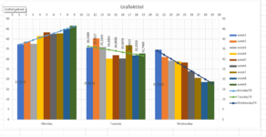
My setup is that I have data for a few weeks of data, and I am trying to compare data on any specific day to data in the following few weeks for the same day. E.g. all Monday data is clustered together.
I created the clustered column type chart, and then switched the row/column under Chart Design menu. This then groups all my Mondays together, Tuesdays together, etc.

Now I want to trend each group of Mondays to see how the data is behaving, but when I try adding the trend line, it trends the first Monday, first Tuesday, first Wednesday... and not Monday 1, Monday 2, Monday 3,etc.

I have seen people mention to calculate your own trendline using LINEST which I can do, but I don't know how to then insert it as a line graph over the existing column chart to appear as a trendline. I have looked at using a secondary y-axis as well, but just not figuring it out.

Any assistance would be appreciated.
 

Excel Facts

Wildcard in VLOOKUP
Use =VLOOKUP("Apple*" to find apple, Apple, or applesauce
can you add a link with a dataset and your actual graph ?
i'm afraid it 'll involve a little bit of VBAand combined graph..
 
Upvote 0
can you add a link with a dataset and your actual graph ?
i'm afraid it 'll involve a little bit of VBAand combined graph..
Thank you for the response. The data is changing on a daily basis, but it really can be any generic data, I am trying to find out how to do it rather.
So an example of data would be for a Monday : (34, 44, 55, 29), Tuesday (38, 47, 60, 35) and Wednesday (54, 52, 63, 59).
These are each in a column, as my data will continue growing down each week. I select all the data, choose to insert a clustered column chart, adn while the data select choose to switch rows/columns (in the design menu while data still selected).
This has the effect of grouping the 4 Mondays together, the 4 Tuesdays, and the 4 Wednesdays (i.e. each value represents another Mon, Tues or Wed).
If you still need me to upload an example I can.
 
Last edited:
Upvote 0
what is your actual excel version ? 2021, 365, ... ?
 
Upvote 0

I suggest that you update your Account details (or click your user name at the top right of the forum) so helpers always know what Excel version(s) & platform(s) you are using as the best solution often varies by version. (Don’t forget to scroll down & ‘Save’)
 
Upvote 0
your clustered graph

Cell Formulas
RangeFormula
B1B1=SLOPE(Tabel1[Monday],Tabel1[[row]:[row]])
C1C1=SLOPE(Tabel1[Tuesday],Tabel1[[row]:[row]])
D1D1=SLOPE(Tabel1[Wednesday],Tabel1[[row]:[row]])
B2B2=INTERCEPT(Tabel1[Monday],Tabel1[[row]:[row]])
C2C2=INTERCEPT(Tabel1[Tuesday],Tabel1[[row]:[row]])
D2D2=INTERCEPT(Tabel1[Wednesday],Tabel1[[row]:[row]])
F2F2=ROWS(Tabel1[row])
B5:B13B5=34+[@row]+RAND()*5
C5:C13C5=34-[@row]+RAND()*10
D5:D13D5=34-2*[@row]+RAND()*5
F5:F13F5=$F$2*F$3+ROW()-ROW(Tabel1[[#Headers],[row2]])+F$3
G5:G13G5=$F$2*G$3+ROW()-ROW(Tabel1[[#Headers],[row3]])+G$3
H5:H13H5=$F$2*H$3+ROW()-ROW(Tabel1[[#Headers],[row4]])+H$3
I5:K13I5=$A5*B$1+B$2
A5:A12A5=ROW()-ROW(Tabel1[[#Headers],[row]])
Named Ranges
NameRefers ToCells
NumberOfRows=Blad1!$F$2F5:H13


You only have to work in the columns B:E, this are now random values with formulas, but enter here your data.
You can delete and insert rows, but keep at least 1 row !

The rest is a table that works with formulas for the graph.
To finalise there was need of a little bit VBA.
You can hide this columns or protect them, to prevent unvolantary changes.

VBA Code:
Private Sub Worksheet_Change(ByVal Target As Range)
     Dim DBR

     Set DBR = Me.ListObjects(1).DataBodyRange                  'your data

     If Intersect(Target, DBR) Is Nothing Then Exit Sub         'did your data change ?

     With Me.ChartObjects(1).Chart                              'your chart

          With .Axes(xlCategory, xlSecondary)                   'adjust secuncary X-axis
               .MinimumScale = 0
               .MaximumScale = [numberofrows] * 3 + 3
          End With

          Set axe1 = .Axes(xlValue, xlPrimary)
          With .Axes(xlValue, xlSecondary)                      'adjust secundary Y-axis, must have equal values as the 1st
               .MinimumScale = axe1.MinimumScale
               .MaximumScale = axe1.MaximumScale
          End With

          For i = 1 To DBR.Rows.Count                           'check/add series

               Do
                    b = (.FullSeriesCollection.Count < i + 3)   'if insufficient series, add a serie
                    If b Then .SeriesCollection.NewSeries
               Loop While b

               With .FullSeriesCollection(i + 3)
                    .Values = "='" & Me.Name & "'!" & DBR.Offset(i - 1, 1).Resize(1, 3).Address     'the range for the values
                    .Name = "='" & Me.Name & "'!" & DBR.Cells(i, 5).Address     'the range for the legend
               End With
          Next

          For i = 1 To 3
               .FullSeriesCollection(i).XValues = "='" & Me.Name & "'!" & DBR.Columns(5 + i).Address     '    x-values for the trendline
               .FullSeriesCollection(i).Values = "='" & Me.Name & "'!" & DBR.Columns(8 + i).Address     '     y-values for the trendline
          Next

     End With

End Sub
 

Attachments

  • Schermafbeelding 2022-03-17 190729.png
    Schermafbeelding 2022-03-17 190729.png
    37.2 KB · Views: 52
Upvote 0
Solution
Oh wow!!!
It is going to take a while to go through it but it looks promising!
Thank you. I hope it was challenging so that it felt satisfying figuring it out :biggrin:
But I do really appreciate your effort.
 
Upvote 0
the challenging thing here, was that for a part you had to switch rows and columns and for that one i choose VBA.
Perhaps other experts or chart-gurus here can do it with formulas (???) but in a 2016-excel, i think there is not very much hope.
 
Upvote 0

Forum statistics

Threads
1,215,561
Messages
6,125,538
Members
449,236
Latest member
Afua

We've detected that you are using an adblocker.

We have a great community of people providing Excel help here, but the hosting costs are enormous. You can help keep this site running by allowing ads on MrExcel.com.
Allow Ads at MrExcel

Which adblocker are you using?

Disable AdBlock

Follow these easy steps to disable AdBlock

1)Click on the icon in the browser’s toolbar.
2)Click on the icon in the browser’s toolbar.
2)Click on the "Pause on this site" option.
Go back

Disable AdBlock Plus

Follow these easy steps to disable AdBlock Plus

1)Click on the icon in the browser’s toolbar.
2)Click on the toggle to disable it for "mrexcel.com".
Go back

Disable uBlock Origin

Follow these easy steps to disable uBlock Origin

1)Click on the icon in the browser’s toolbar.
2)Click on the "Power" button.
3)Click on the "Refresh" button.
Go back

Disable uBlock

Follow these easy steps to disable uBlock

1)Click on the icon in the browser’s toolbar.
2)Click on the "Power" button.
3)Click on the "Refresh" button.
Go back
Back
Top