kanushreeprasad
New Member
- Joined
- Oct 26, 2023
- Messages
- 1
- Office Version
- 365
- Platform
- Windows
Hello, need help in creating a band penetration graph for salary please.
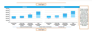
I got the box and whisker plot(the blue bit) but can't seem to plot where the individuals salary is (the red point). attached a sample of what I would like to create.
For example:
P25: Usd 125
P75: Usd 500
I get the box and whiskers plot for this. However, I would want to on this plot the individual's salary to show where it lies on the band. How can I integrate this?