Excel Map Chart

jmbarnes65

New Member
Joined
May 25, 2023
Messages
1
Office Version
  1. 365
Platform
  1. Windows
Good Afternoon,
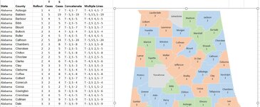
I have created a map chart of the state of Alabama showing all counties. Here are my goals:
  • shade each county based on its rollout month (1-4)
  • display the following in each county
    • Number of T cases
    • Number of S cases
I can get it to shade the counties using a Diverging 3 Color "Series Color" but am unable to get the T cases and S cases values to display for each county. The only value I can get to display is the Rollout number. Can anyone help? I'm using Excel 365.
 

Attachments

  • AL Map.JPG
    AL Map.JPG
    153.2 KB · Views: 8

Excel Facts

Why are there 1,048,576 rows in Excel?
The Excel team increased the size of the grid in 2007. There are 2^20 rows and 2^14 columns for a total of 17 billion cells.

Forum statistics

Threads
1,215,112
Messages
6,123,162
Members
449,099
Latest member
afishi0nado

We've detected that you are using an adblocker.

We have a great community of people providing Excel help here, but the hosting costs are enormous. You can help keep this site running by allowing ads on MrExcel.com.
Allow Ads at MrExcel

Which adblocker are you using?

Disable AdBlock

Follow these easy steps to disable AdBlock

1)Click on the icon in the browser’s toolbar.
2)Click on the icon in the browser’s toolbar.
2)Click on the "Pause on this site" option.
Go back

Disable AdBlock Plus

Follow these easy steps to disable AdBlock Plus

1)Click on the icon in the browser’s toolbar.
2)Click on the toggle to disable it for "mrexcel.com".
Go back

Disable uBlock Origin

Follow these easy steps to disable uBlock Origin

1)Click on the icon in the browser’s toolbar.
2)Click on the "Power" button.
3)Click on the "Refresh" button.
Go back

Disable uBlock

Follow these easy steps to disable uBlock

1)Click on the icon in the browser’s toolbar.
2)Click on the "Power" button.
3)Click on the "Refresh" button.
Go back
Back
Top