Horizontal bar chart with two axis without overlap?

sdk

New Member
Joined
Mar 17, 2010
Messages
33
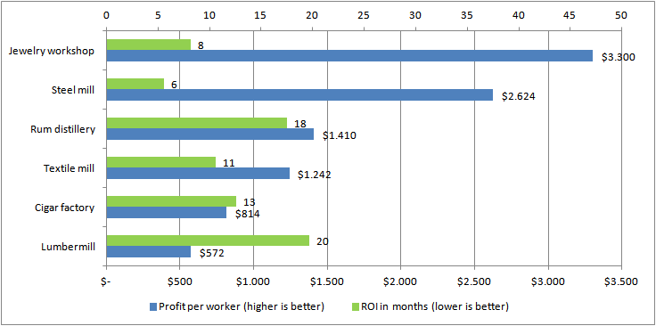
Hi there, I am trying to display two data ranges in one graph. The first ranges from 1000 to 10.000 and the other one from 5 to 23. They apply to the same labels. A default excel graph will therefore hardly show the second data set.

I googled and tried to create a secondary axis. Unfortunately they overlap. Online tutorials "fix" this by changing the second data range to a line chart. I do not want this because
a) I am using Horizintal bars so it does not make sense
b) I like bars better for this data

I actually found someone that did almost exactly what I want, besides the verticle bars:
twopanelcols03.png


But unfortunately Mr Peltiers tutorial does not explain how to get the offset right (he believes it is a bad graph). I have tried but failed. I tried to set position of axis to "between" but that messes up the graph.

Is there anyone that can explain how I get the offset right?

ps: This form is bugged on IE 11, message too short error and unable to copy/paste and delayed input (The window does not keep up with my typing speed)
 

Excel Facts

Pivot Table Drill Down
Double-click any number in a pivot table to create a new report showing all detail rows that make up that number
sdk,

If you're set on this graph, you could add two dummy series (all zeroes) to push the other bars around. One on the primary axis, after your real data, to push it "down"; the other on the secondary axis before your data, to push it "up". Play with the order of series in the 'select data' window to achieve the effect you're after.

Cheers,
Rukt
 
Upvote 0
sdk,

If you're set on this graph, you could add two dummy series (all zeroes) to push the other bars around. One on the primary axis, after your real data, to push it "down"; the other on the secondary axis before your data, to push it "up". Play with the order of series in the 'select data' window to achieve the effect you're after.

Cheers,
Rukt
That sounds like a great idea:). Thanks!
 
Upvote 0
Ok I finished it:
ucQDcXx.png


Anyone thought about a "better" way to depict this data? Or is it clear :)?
 
Upvote 0
Anyone thought about a "better" way to depict this data?

How about a scatter plot? Put Profit per worker on say the horizontal axis, and ROI (do you mean "payback period"?) on the vertical axis. Apply data labels to identify each point. Your best-performing assets would be in the lower right quadrant, with high profit and low ROI.

Edit: applying asset names as data labels is made much easier in Excel 2013, using the "value from cells" option. Otherwise, this add-in should do the trick (Disclaimer: I haven't personally used it).
http://www.appspro.com/Utilities/ChartLabeler.htm

Rukt
 
Last edited:
Upvote 0
How about a scatter plot? Put Profit per worker on say the horizontal axis, and ROI (do you mean "payback period"?) on the vertical axis. Apply data labels to identify each point. Your best-performing assets would be in the lower right quadrant, with high profit and low ROI.

Edit: applying asset names as data labels is made much easier in Excel 2013, using the "value from cells" option. Otherwise, this add-in should do the trick (Disclaimer: I haven't personally used it).
The XY Chart Labeler Add-in

Rukt
Scatterplot sounds awesome. Didn't even know Excel had them.
 
Upvote 0

Forum statistics

Threads
1,215,517
Messages
6,125,290
Members
449,218
Latest member
Excel Master

We've detected that you are using an adblocker.

We have a great community of people providing Excel help here, but the hosting costs are enormous. You can help keep this site running by allowing ads on MrExcel.com.
Allow Ads at MrExcel

Which adblocker are you using?

Disable AdBlock

Follow these easy steps to disable AdBlock

1)Click on the icon in the browser’s toolbar.
2)Click on the icon in the browser’s toolbar.
2)Click on the "Pause on this site" option.
Go back

Disable AdBlock Plus

Follow these easy steps to disable AdBlock Plus

1)Click on the icon in the browser’s toolbar.
2)Click on the toggle to disable it for "mrexcel.com".
Go back

Disable uBlock Origin

Follow these easy steps to disable uBlock Origin

1)Click on the icon in the browser’s toolbar.
2)Click on the "Power" button.
3)Click on the "Refresh" button.
Go back

Disable uBlock

Follow these easy steps to disable uBlock

1)Click on the icon in the browser’s toolbar.
2)Click on the "Power" button.
3)Click on the "Refresh" button.
Go back
Back
Top