I for the life of me cannot figure out how to create this chart!

xperronex

New Member
Joined
Mar 2, 2009
Messages
12
Hi all,

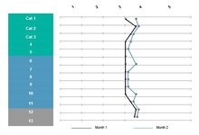
We have survey data that measures a team on a number of categories on a scale of 1-5. I'd like to have the categories themselves on the Y axis (13 total) and the 1-5 scale on the X axis, and each line would be a different response to the survey. The lines would be vertical, to show how a team is progressive over time in these categories. Sample data is below:

Month 1Month 2
Category 133
Category 224
Category 323
Category 433
Category 533
Category 633
Category 733
Category 822
Category 944
Category 1033
Category 1123
Category 1212
Category 1323

No matter what, I can't get this data to look the way I am describing. Could someone help? Thanks!
 

Excel Facts

Return population for a City
If you have a list of cities in A2:A100, use Data, Geography. Then =A2.Population and copy down.
Are you able to draw a picture of the graph as to you would like it?
 
Upvote 0
something like this?
I'm not sure how to get a vertical portion in your data, to me the vertical line you ask for is contradictory to the way you want the graph designed. So, a visual picture of what you want is really needed. But with this you can see how the two months are compared, for progress.

1685558663056.png
 
Upvote 0
I removed a lot of priprietary info so it looks a little crummy, but you get the gist!
 

Attachments

  • chart.JPG
    chart.JPG
    28.3 KB · Views: 7
Upvote 0
I've never seen a transposed line graph before. I know there are graphs that have drop lines. but not sure how that could work with your question.

But frankly, I don't see how that chart is an EASILY understood visualization of changes from one month to the next in terms of categories compared to the clustered bar chart i posted earlier. To me lines are trends that visualize changes of a similar item over time, not of multiple items for the same time period. I'm sure some folks may disagree.

There are plenty of ways to make the basic excel charts pop with icons, formatting, and conditional highlighting that don't make the viewing more difficult. Check out the you tube channels at MyOnlineTrainingHub and Leila Gharani, as well as Mr. Excel you tube channel.
 
Upvote 0

Forum statistics

Threads
1,215,069
Messages
6,122,953
Members
449,095
Latest member
nmaske

We've detected that you are using an adblocker.

We have a great community of people providing Excel help here, but the hosting costs are enormous. You can help keep this site running by allowing ads on MrExcel.com.
Allow Ads at MrExcel

Which adblocker are you using?

Disable AdBlock

Follow these easy steps to disable AdBlock

1)Click on the icon in the browser’s toolbar.
2)Click on the icon in the browser’s toolbar.
2)Click on the "Pause on this site" option.
Go back

Disable AdBlock Plus

Follow these easy steps to disable AdBlock Plus

1)Click on the icon in the browser’s toolbar.
2)Click on the toggle to disable it for "mrexcel.com".
Go back

Disable uBlock Origin

Follow these easy steps to disable uBlock Origin

1)Click on the icon in the browser’s toolbar.
2)Click on the "Power" button.
3)Click on the "Refresh" button.
Go back

Disable uBlock

Follow these easy steps to disable uBlock

1)Click on the icon in the browser’s toolbar.
2)Click on the "Power" button.
3)Click on the "Refresh" button.
Go back
Back
Top