Is it possible to change chart type based on how many time points are available?

Rnkhch

Well-known Member
Joined
Apr 28, 2018
Messages
528
Office Version
  1. 365
Platform
  1. Windows
Hello,

I have tables that correspond to 15 timepoints that automatically get updated based on values entered in source tables, and I have xy charts with dots that also automatically adapt to the tables.

Now, certain people in my organization only use the first time point (day 0) and have no need for the remaining time points. Since a bar chart is more suitable for one time point, I'm wondering whether I could use VBA to automatically change the chart type to a bar charts if only one time point appears in my tables? If possible, could someone let me know of the VBA code? This would be a really cool feature to add to my file :) .

Thanks for any input!
 

Excel Facts

Test for Multiple Conditions in IF?
Use AND(test, test, test, test) or OR(test, test, test, ...) as the logical_test argument of IF.
hello,
i 'd start with the macro-recorder and do all the steps to go from your XY-chart to the bar chart and back. Then you can optimize that macro.
Or you can add your file here (with a link)
 
Upvote 0
Thank you! Since I don't know much about macros, I will make a simpler version of my file (as I cannot share the organization file), and I will add it here. By the way, how does adding with a link work?
 
Upvote 0
there are a lot of sites where you can share a file like GoogleDrive, OneDrive, WeTransfer, Dropbox, ... .
Once you placed a file there, you get a link and that one you add with the chain-icon (or CTRL+K) just left of the smiley-icon in the ribbon. In the popup, 1st field, you copy that string, 2nd field you add a short description (like "Rnkhch.xlsx" or something similar)
 
Upvote 0
Hi,

Sorry for the delay (got swamped at works plus jury duty and an accident Friday night 😭). Here is a sample file that I put in WeTransfer. I removed all the formulas that automatically generate the numbers for the chart and pasted values, but the defined names for averages and error values that the chart uses are still in there. In this file, I included a formula in cell C18 that I thought might help you. It checks to see how many time points are available and shows a 0 if one time point is there and 1 if more time points are available, but you may have a better mechanism, so please use whatever you know is best, in the code. The file is already in xlsm extension. Looking forward to seeing your magic :)

By the way, in my real file, there are another three charts under this chart, and a few sets of the four charts to the right of the first set, so I will need to apply your code to all charts. Hopefully I'll be able to figure that out once I see your code.

Thank you!


P.S. one more question regarding this particular chart type in my file: as you can see, the error bar up and down caps for the first time point dots don't show up completely and only the right halves are there. I believe it happens because the first time point zero is too close to the y-axis (by default)? I don't know how to make these first time point caps to show up completely. If you could fix that too, that would be awesome :)

Rnkhch.xlsm
 
Upvote 0
rnkhch
Just an answer to the first part, the rest is for tomorow.

VBA Code:
Sub FlipFlopChart()

     With ActiveSheet.ChartObjects("Chart 9").Chart     'your chart

          If .ChartType <> xlColumnClustered Then     'if the chart isn't columnclustered

               .ChartType = xlColumnClustered     'now it's columnclustered
               With .Axes(xlCategory)     'just for 1 point
                    .MinimumScale = 0
                    .MaximumScale = 0
               End With
               For i = 1 To .FullSeriesCollection.Count     'for each serie
                    .FullSeriesCollection(i).ApplyDataLabels
                    .FullSeriesCollection(i).DataLabels.ShowValue = True     'show the values
               Next

          Else
               .ChartType = xlXYScatterLinesNoMarkers     'now it's xyscatter
               With .Axes(xlCategory)     'just for 1 point
                    .MinimumScale = 0
                    .MaximumScale = 90
               End With
               For i = 1 To .FullSeriesCollection.Count
                    .FullSeriesCollection(i).DataLabels.Delete     'no labels
               Next
          End If
     End With

End Sub
 
Upvote 0
Thank you! I just did a test, and here are the issues I observed:

1. I deleted all days one by one except day 0, expecting that as soon as I delete all columns except day 0, my chart would turn to a barchart, and it didn't.
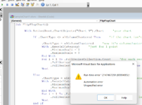
2. Then I opened the code and hit run (the play button), and then I got an error message in the attached picture.
3. Only then (i.e. after running the code and closing the editor window) the chart type changed so it seems that with the current code the chart type change is not automatic?
4. The bars are clustered together. Could you change them into separate bars?
5. I started adding data columns back after day 0. For example I added two days, and I just copy/pasted the values from day 0 expecting that my chart would now automatically change back to xy lines, but instead the bar clusters duplicated and then triplicated as I added the second and then third days' data (attached file) 😭

And one more point :biggrin: :

6. The max will not necessarily be 90. There are 15 time points possible, and in the initial example, there were eight time points and the last one happened to be at day 90, but more time points will be added in future as the experiment continues, so for example, there will be day 140, 200, etc. So the code needs to be be changed to reflect the time points, not the day numbers? Of course since the first day is always zero, then I think this part of your code will technically work fine because any additional time point will be greater than zero, but I will need your opinion on this aspect.

No rush, whenever you get a chance 😁

Thanks!

Rnkhch.xlsm
 

Attachments

  • 2022-06-19-2.png
    2022-06-19-2.png
    143.8 KB · Views: 4
Last edited:
Upvote 0
rnkhch
you hope this one goes better.
If the first point isn't day "0", it also works.
The overlap between the series is now random between 0 and -100, you can fix that to your own choice.
 
Upvote 0
Just tested this. This one is not automatic though 😭 And it has its own issues. For example, when I delete one or more days, the bars don't decrease (I went even down to day 0 only, and it still showed six bars). And in the xyline mode, the data dots don't show up. And when there is day 0 only, I see -1 in the x-axis 😭

Hope you can keep it automatic and solve all the issues 😁 whenever you get a chance. Thanks!
 
Upvote 0
I hope this solves your remarks.
It wasn't automatic until now, i had that toggle-mode with that commandbutton ...
Rnkhch
 
Upvote 0

Forum statistics

Threads
1,215,333
Messages
6,124,317
Members
449,153
Latest member
JazzSingerNL

We've detected that you are using an adblocker.

We have a great community of people providing Excel help here, but the hosting costs are enormous. You can help keep this site running by allowing ads on MrExcel.com.
Allow Ads at MrExcel

Which adblocker are you using?

Disable AdBlock

Follow these easy steps to disable AdBlock

1)Click on the icon in the browser’s toolbar.
2)Click on the icon in the browser’s toolbar.
2)Click on the "Pause on this site" option.
Go back

Disable AdBlock Plus

Follow these easy steps to disable AdBlock Plus

1)Click on the icon in the browser’s toolbar.
2)Click on the toggle to disable it for "mrexcel.com".
Go back

Disable uBlock Origin

Follow these easy steps to disable uBlock Origin

1)Click on the icon in the browser’s toolbar.
2)Click on the "Power" button.
3)Click on the "Refresh" button.
Go back

Disable uBlock

Follow these easy steps to disable uBlock

1)Click on the icon in the browser’s toolbar.
2)Click on the "Power" button.
3)Click on the "Refresh" button.
Go back
Back
Top