Issue with Scatter Plot for the last point

richard1234567891011

Board Regular
Joined
Feb 21, 2018
Messages
91
Hi guys,

I have an issue with this chart.


1587425363684.png


I have these data for the "Lorenz curve"

1587425476598.png
1587425488039.png

The first for the X and the second for the Y,
Now I don't understand why the chart is not representing a correct connection in the last point. The last point is X=100% and Y=100% Why the chart is representing the point in this way?

(the last point should be an angle at 90)

Thank you very much guys.
 

Attachments

  • 1587425453406.png
    1587425453406.png
    3.2 KB · Views: 8

Excel Facts

Pivot Table Drill Down
Double-click any number in a pivot table to create a new report showing all detail rows that make up that number
What are you trying to plot? x vs. y...do you want % people accumulated as the x array and % income accumulated as the y array? What is shown is an interpreted or assumed set of x values, where the left column is being used for both x and y values, generating the blue curve. And then the same left column is being taken as x and the % income accumulated is y. Are you expecting one curve or two. If two, then is it advisable to explicitly add a left most column of actual x values to eliminate this potential confusion.

As for the odd shape in the orange curve, that is due to how Excel interprets the list of data, connecting point to point, so the next to last point is (0.875,0) and the last point is (1,1)...and you get a line of finite slope. To correct this, you would have to add in one more point, so the last three points would be (0.875,0), (1,0), and (1,1).

MrExcel20200419a.xlsx
ABC
1x values% people% inc acc
2000
312.512.50
425250
537.537.50
650500
762.562.50
875750
987.587.50
101001000
11100100
Sheet9
 

Attachments

  • plot.png
    plot.png
    7.7 KB · Views: 6
Upvote 0
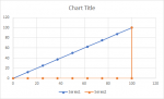
Sure. When presenting a plot, it should be easy for the reader to understand what the author is attempting to convey. In this case, there are two curves plotted in x-y space, but there are no clear indicators showing how the curves relate to each other or what they mean. It appears that you selected the % people column and the % income earned column and constructed an x-y (scatter) chart, but it is not clear what was used for the x data...because if you selected just two arrays of data, and then made an x-y scatter chart, you would get only one plotted set of points (or one curve) showing x vs. y. You have two curves. It appears that you may have added a second plot, essentially plotting the % people points against themselves to create the Equality Curve, but this is a point of confusion.

When constructing a Lorenz Curve, the plot limits are (1,1), meaning 100 % on the x-axis for percentile of people and 100 % on the y-axis of cumulative income. That would typically be constructed with just two points: (0,0) and (1,1), and those data points are typically hidden...you want only the line connecting the two. Yet you show a number of data points along the equality line, which leads one to wonder where the x-data are to support that line.

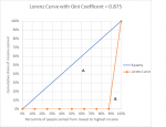
Axis labels help to explain the relationships depicted by the data. My original point was that in order to produce a true step in the Lorenz Curve, you would have to add an extra data point to force a 90 degree vertex at location (100,0). But based on my understanding of Lorenz Curves, I do not believe that is advisable. Generally, arbitrarily adding a data point to a data set is a bad idea because you would be representing that the added data point means something about the phenomena being presented. In this case it would not: 100 % of the people cannot simultaneously be responsible for 0 % and 100 % of the earned income.

Instead, the data are indicating that 87.5% of the people represented make no money; and the remaining 12.5% of the people account for all of the earned income. This represents a gross disparity in income equality, and the large area between the Equality Curve and the Lorenz Curve illustrate this. As for the plot title, the plot does not really show the Gini Coefficient, but rather it shows the Lorzenz Curve. One can determine the Gini Coefficent from the data. The worksheet where I played around with the data and plots is available at the link below (I would normally post a sample of the worksheet using XL2BB, but that doesn't support embedded plots as far as I know). I suspect you want to show two sets of data: one to create the Equality Curve, the other to create the Lorenz Curve...see Data Set C in the file for an example. which was used to produce the plot shown here. I've also added the triangular area calculations that are used to determine areas for the Gini Coefficient calculation.


Attachments

  • plot2.png
    plot2.png
    20.1 KB · Views: 5
Upvote 0

Forum statistics

Threads
1,215,491
Messages
6,125,111
Members
449,205
Latest member
ralemanygarcia

We've detected that you are using an adblocker.

We have a great community of people providing Excel help here, but the hosting costs are enormous. You can help keep this site running by allowing ads on MrExcel.com.
Allow Ads at MrExcel

Which adblocker are you using?

Disable AdBlock

Follow these easy steps to disable AdBlock

1)Click on the icon in the browser’s toolbar.
2)Click on the icon in the browser’s toolbar.
2)Click on the "Pause on this site" option.
Go back

Disable AdBlock Plus

Follow these easy steps to disable AdBlock Plus

1)Click on the icon in the browser’s toolbar.
2)Click on the toggle to disable it for "mrexcel.com".
Go back

Disable uBlock Origin

Follow these easy steps to disable uBlock Origin

1)Click on the icon in the browser’s toolbar.
2)Click on the "Power" button.
3)Click on the "Refresh" button.
Go back

Disable uBlock

Follow these easy steps to disable uBlock

1)Click on the icon in the browser’s toolbar.
2)Click on the "Power" button.
3)Click on the "Refresh" button.
Go back
Back
Top