UnluckyXIII
New Member
- Joined
- May 13, 2015
- Messages
- 20
- Office Version
- 365
- Platform
- Windows
Hi All,
I'm hoping someone can help me in how I would go about creating a Pie Chart that can show my data (example data below).
So the data above shows each flavour of ice cream with 5 metrics which they are measured against (1 = Good / 2 = Ok / 3 = Poor), I want to be able to create a pie chart that will look at this data and let me know how many of the flavours have a 3 rating for each metric (I'm happy to have 1 chart per metric).
I've played around in excel but can't seem to manipulate the data in a way that gives me the results I would like, does anyone know if what I'm trying to do is possible? And if not what alternatives do I have?
Kind regards,
XIII
I'm hoping someone can help me in how I would go about creating a Pie Chart that can show my data (example data below).
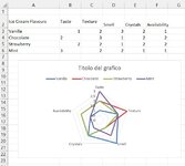
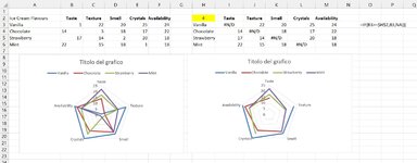
| Ice Cream Flavours | Taste | Texture | Smell | Crystals | Availability |
| Vanilla | 1 | 2 | 3 | 2 | 1 |
| Chocolate | 2 | 3 | 1 | 2 | 2 |
| Strawberry | 2 | 2 | 1 | 2 | 2 |
| Mint | 3 | 2 | 2 | 1 | 1 |
So the data above shows each flavour of ice cream with 5 metrics which they are measured against (1 = Good / 2 = Ok / 3 = Poor), I want to be able to create a pie chart that will look at this data and let me know how many of the flavours have a 3 rating for each metric (I'm happy to have 1 chart per metric).
I've played around in excel but can't seem to manipulate the data in a way that gives me the results I would like, does anyone know if what I'm trying to do is possible? And if not what alternatives do I have?
Kind regards,
XIII