Plotting 3 points per data set in lollipop-type chart

charllottesu

New Member
Joined
Jan 16, 2024
Messages
2
Office Version
  1. 365
Platform
  1. Windows
Hi,

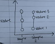
I am wanting to plot a graph where I have multiple data points per category of data. For some context, I have done some analysis on different samples and now have up to 3 data points for each sample and I am wanting to present them in a lollipop chart-type way (see image). I'm wondering if this is possible to plot in excel, and if not, what is the easiest way to plot data in this way?

It would also be helpful if I could have 2 of these 'lines' of 3 data points (e.g. different colours) for each sample to present different values I'm extracting from the data of each.

Thanks,
Charllotte
 

Attachments

  • 1-min (1).png
    1-min (1).png
    167 KB · Views: 4

Excel Facts

Add Bullets to Range
Select range. Press Ctrl+1. On Number tab, choose Custom. Type Alt+7 then space then @ sign (using 7 on numeric keypad)
There may be a template for this type of chart somewhere, but I would likely just make it a Scatter Chart with Straight Lines and Markers. For each Sequence of data, repeat the X value for each Y. Change the marker to a circle and make the size much larger than normal (my chart has them at size 10). Then for the horizontal axis, I changed the major and minor Units to 1.0 and made the Bounds-Maximum 2.9 so the label for 3 would not show. It was the easiest way I could think of to achieve the effect you are desiring.

Book1
ABCD
1Sequence1Sequence2
2XYXY
31826
4110211
5112215
Sheet1

1705528091083.png
 
Upvote 0
There may be a template for this type of chart somewhere, but I would likely just make it a Scatter Chart with Straight Lines and Markers. For each Sequence of data, repeat the X value for each Y. Change the marker to a circle and make the size much larger than normal (my chart has them at size 10). Then for the horizontal axis, I changed the major and minor Units to 1.0 and made the Bounds-Maximum 2.9 so the label for 3 would not show. It was the easiest way I could think of to achieve the effect you are desiring.

Book1
ABCD
1Sequence1Sequence2
2XYXY
31826
4110211
5112215
Sheet1

View attachment 105270
Thank you for your reply! I have plotted similar graphs to the type are describing however my issue is that the X-axis “values” would actually be sample names rather than numbers so for example it would be “human 1 sample” and that sample would have 3 data points. I’m not aware of any way to plot that type of graph with “categories” on the x-axis.
 
Upvote 0

Forum statistics

Threads
1,215,077
Messages
6,122,992
Members
449,094
Latest member
masterms

We've detected that you are using an adblocker.

We have a great community of people providing Excel help here, but the hosting costs are enormous. You can help keep this site running by allowing ads on MrExcel.com.
Allow Ads at MrExcel

Which adblocker are you using?

Disable AdBlock

Follow these easy steps to disable AdBlock

1)Click on the icon in the browser’s toolbar.
2)Click on the icon in the browser’s toolbar.
2)Click on the "Pause on this site" option.
Go back

Disable AdBlock Plus

Follow these easy steps to disable AdBlock Plus

1)Click on the icon in the browser’s toolbar.
2)Click on the toggle to disable it for "mrexcel.com".
Go back

Disable uBlock Origin

Follow these easy steps to disable uBlock Origin

1)Click on the icon in the browser’s toolbar.
2)Click on the "Power" button.
3)Click on the "Refresh" button.
Go back

Disable uBlock

Follow these easy steps to disable uBlock

1)Click on the icon in the browser’s toolbar.
2)Click on the "Power" button.
3)Click on the "Refresh" button.
Go back
Back
Top