Power BI Line chart visual

shansakhi

Active Member
Joined
Apr 5, 2008
Messages
276
Office Version
  1. 365
Platform
  1. Windows
Hello ALl,
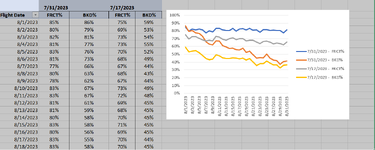
Need your assistance to to create below Line Chart in Power BI visual.
I tried, but unable to add "As on date" as column filter like excel.
Please guide me to do it.


Forecast Post RMA_1.xlsx
ABCDE
87/31/20237/17/2023
9Flight Date FRCT% BKD% FRCT% BKD%
108/1/202385%86%75%59%
118/2/202380%79%69%53%
128/3/202382%81%73%54%
138/4/202381%77%73%55%
148/5/202383%76%70%52%
158/6/202381%73%68%49%
168/7/202377%66%67%44%
178/8/202380%63%68%43%
188/9/202378%62%67%44%
198/10/202383%67%73%49%
Date Level


Regards,
Shan
 

Attachments

  • As on Date.PNG
    As on Date.PNG
    57.7 KB · Views: 10

Excel Facts

Formula for Yesterday
Name Manager, New Name. Yesterday =TODAY()-1. OK. Then, use =YESTERDAY in any cell. Tomorrow could be =TODAY()+1.
To get that kind of chart in Power BI you will probably need a data layout that looks like this:

1691263726980.png


The transformation steps I used in Power Query to do this was:

Power Query:
let
    Source = Excel.Workbook(File.Contents("C:\Users\GooberTron\Desktop\Power Query Tests\shansakhi.xlsx"), null, true),
    Sheet1_Sheet = Source{[Item="Sheet1",Kind="Sheet"]}[Data],
    #"Transposed Table" = Table.Transpose(Sheet1_Sheet),
    #"Filled Down" = Table.FillDown(#"Transposed Table",{"Column1"}),
    #"Merged Columns" = Table.CombineColumns(#"Filled Down",{"Column1", "Column2"},Combiner.CombineTextByDelimiter(" - ", QuoteStyle.None),"Series"),
    #"Transposed Table1" = Table.Transpose(#"Merged Columns"),
    #"Promoted Headers" = Table.PromoteHeaders(#"Transposed Table1", [PromoteAllScalars=true]),
    #"Unpivoted Other Columns" = Table.UnpivotOtherColumns(#"Promoted Headers", {" - Flight Date"}, "Attribute", "Value"),
    #"Renamed Columns" = Table.RenameColumns(#"Unpivoted Other Columns",{{" - Flight Date", "Flight Date"}, {"Attribute", "Series"}, {"Value", "Percent"}}),
    #"Changed Type" = Table.TransformColumnTypes(#"Renamed Columns",{{"Series", type text}, {"Percent", Percentage.Type}}),
    #"Changed Type with Locale" = Table.TransformColumnTypes(#"Changed Type", {{"Flight Date", type text}}, "en-US")
in
    #"Changed Type with Locale"

You will need to adjust the Source steps and perhaps you won't need the "Changed Type with Locale". But it gives you an idea of how it works. If you can fix your data layout at source, then it might be easier to do that.

I got this chart from your example data:

1691264024222.png
 
Upvote 0
Solution

Forum statistics

Threads
1,215,110
Messages
6,123,143
Members
449,098
Latest member
Doanvanhieu

We've detected that you are using an adblocker.

We have a great community of people providing Excel help here, but the hosting costs are enormous. You can help keep this site running by allowing ads on MrExcel.com.
Allow Ads at MrExcel

Which adblocker are you using?

Disable AdBlock

Follow these easy steps to disable AdBlock

1)Click on the icon in the browser’s toolbar.
2)Click on the icon in the browser’s toolbar.
2)Click on the "Pause on this site" option.
Go back

Disable AdBlock Plus

Follow these easy steps to disable AdBlock Plus

1)Click on the icon in the browser’s toolbar.
2)Click on the toggle to disable it for "mrexcel.com".
Go back

Disable uBlock Origin

Follow these easy steps to disable uBlock Origin

1)Click on the icon in the browser’s toolbar.
2)Click on the "Power" button.
3)Click on the "Refresh" button.
Go back

Disable uBlock

Follow these easy steps to disable uBlock

1)Click on the icon in the browser’s toolbar.
2)Click on the "Power" button.
3)Click on the "Refresh" button.
Go back
Back
Top