Jennlax27iga0
New Member
- Joined
- May 4, 2011
- Messages
- 21
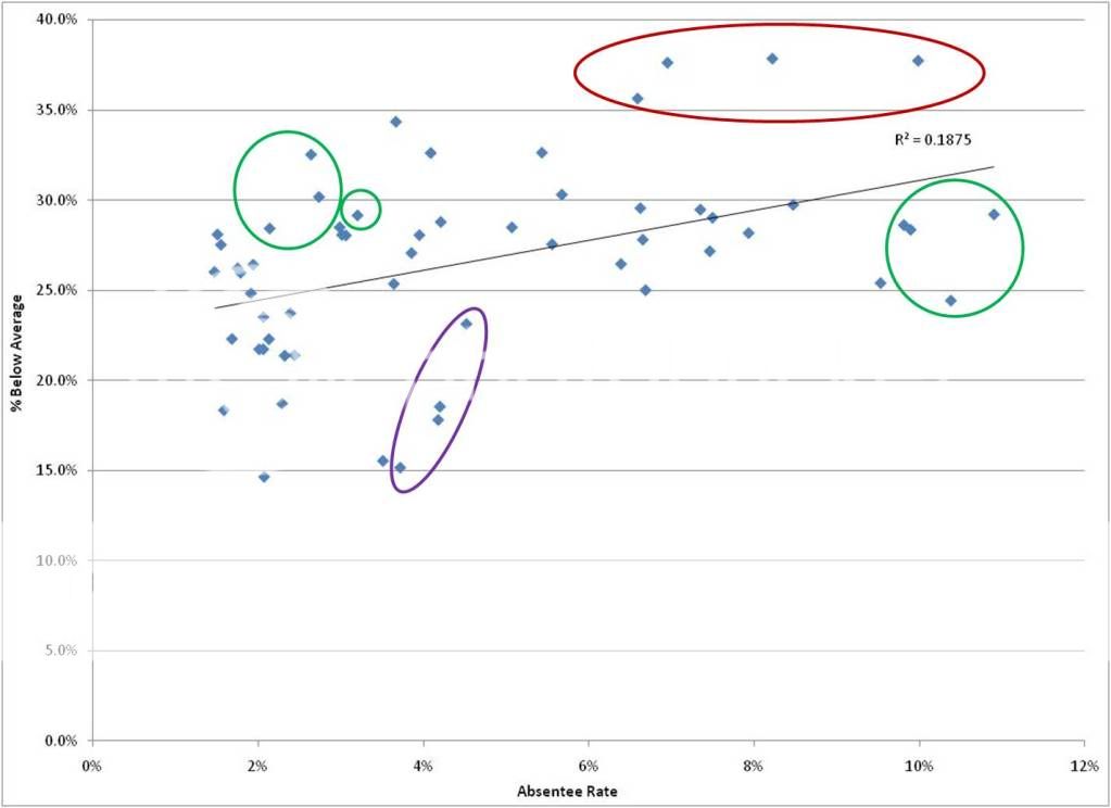
Not sure if this is the correct forum, if not any suggestions on where to post would be welcome. I have graphed a scatter plot and trendline in Excel and have been trying to analyze the significance of the r-squared value. The graph covers 4 years so there are 4 points for each team graphed.
In looking at the graph I thought the group circled in red was impacting the r-squared value the most due to it's variance/distance from the trendline, however removing that group lowered the r-squared value. The two groups that actually had the greatest impact/ lowered the r-squared value the most are circled in green (the group with the third greatest impact is circled in purple). If someone can help give me some insight into why this is the case, I would greatly appreciate it (not sure if I'm not understanding the Excel calculation/formula, or the general concept). Thanks.
In looking at the graph I thought the group circled in red was impacting the r-squared value the most due to it's variance/distance from the trendline, however removing that group lowered the r-squared value. The two groups that actually had the greatest impact/ lowered the r-squared value the most are circled in green (the group with the third greatest impact is circled in purple). If someone can help give me some insight into why this is the case, I would greatly appreciate it (not sure if I'm not understanding the Excel calculation/formula, or the general concept). Thanks.
 ffice
ffice


