Gauge Chart - Getting Needle to Work

Malikai

New Member
Joined
Nov 29, 2023
Messages
3
Office Version
  1. 365
Platform
  1. Windows
Howdy folks,

My first post here, so thanks in advance and bear with me. Our manufacturing plant is audited monthly and given a score. Based on the score, associates are given a bonus of a percentage of earnings during the month. I'm trying to create a guage (speedometer) chart that will show both the audit score and the associated bonus payout percentage.

Any score below 75 pays out zero, and any score 80 or higher pays out 1.25%.
1701293611635.png


I would like the user to be able to enter the audit score and have the chart needle reflect the score and line up with the bonus percentage as well.

With a range of 74 to 80, I calculated the slices at 0.6. I am able to create two doughnut charts and change one of them to display the payout values, but I cannot figure out how to get the needle to move properly and line up with the audit score.

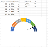
For example, when I enter 75 for the audit score, I get the first image. If I change it to 79, rather than moving to the right side, I get this 2nd image.
1701293037104.png
1701293100565.png


I am open to including a higher range of values, but I do not expect to ever see scores below 50 or higher than 95. If it helps create the chart, I am open to it.

Thanks a bunch!
 

Excel Facts

Ambidextrous Undo
Undo last command with Ctrl+Z or Alt+Backspace. If you use the Undo icon in the QAT, open the drop-down arrow to undo up to 100 steps.
It is to do with the scale in which the needle moves. you are only moving 1 to 6points i(74 to 80) in relation to the segments. Each segment accounts for a 14th of the graph range(!) meaning to move the needle it needs to ncrement 534/14-5 (needle thickness) each time. Really hope this makes sense...!

I've assumed your needle is on a seperate chart in which case I knocked this up quickly and added in another range to look up the needle position...

I added in the below formulas...

Column Y, NEW Position...
Values represent the movement for the needle for each increment of 1 = Sum(529/14)*X where X is the increment up from74 so 1,2,3,4,5 or 6. I have rounded the figures in the below as well.

Column AB, Position - This one looks up the score column W for me and returns the needle increment to move by, column Y for me...
Excel Formula:
=XLOOKUP(AB7,$W$8:$W$15,Y8:Y15)

Column AB, Rest - this is the total range of the graph 529 (already less the needle thickness) minus the position
Excel Formula:
=529-AB8

Audit result - is no longer in the range for the graph, this sits outside of it and is used to lookup the 'Position' value.

I also adjusted the 'Position of first slice' to be 270...

1701351452438.png


My results returned the below, 80...
1701351545418.png


77...
1701351577477.png

70...
1701351520526.png


If you were to add 9 to each of the posistion it would come to tne centre of each segment...
1701351755857.png


Really hope this makes sense I've read it several times and added in more explanations each time!

Steven
 

Attachments

  • 1701351053924.png
    1701351053924.png
    29.2 KB · Views: 2
Upvote 0
Solution
It is to do with the scale in which the needle moves. you are only moving 1 to 6points i(74 to 80) in relation to the segments. Each segment accounts for a 14th of the graph range(!) meaning to move the needle it needs to ncrement 534/14-5 (needle thickness) each time. Really hope this makes sense...!

I've assumed your needle is on a seperate chart in which case I knocked this up quickly and added in another range to look up the needle position...

I added in the below formulas...

Column Y, NEW Position...
Values represent the movement for the needle for each increment of 1 = Sum(529/14)*X where X is the increment up from74 so 1,2,3,4,5 or 6. I have rounded the figures in the below as well.

Column AB, Position - This one looks up the score column W for me and returns the needle increment to move by, column Y for me...
Excel Formula:
=XLOOKUP(AB7,$W$8:$W$15,Y8:Y15)

Column AB, Rest - this is the total range of the graph 529 (already less the needle thickness) minus the position
Excel Formula:
=529-AB8

Audit result - is no longer in the range for the graph, this sits outside of it and is used to lookup the 'Position' value.

I also adjusted the 'Position of first slice' to be 270...

View attachment 102721

My results returned the below, 80...
View attachment 102723

77...
View attachment 102724
70...
View attachment 102722


If you were to add 9 to each of the posistion it would come to tne centre of each segment...
View attachment 102725


Really hope this makes sense I've read it several times and added in more explanations each time!

S
 
Upvote 0
Thanks a bunch, Steven! I have a much better understanding of how the pie chart is orienting itself with the two doughnut graphs. Our score was a 79. With your assistance and some formatting, here is the update:
1701367903092.png
 
Upvote 0

Forum statistics

Threads
1,215,069
Messages
6,122,958
Members
449,096
Latest member
Anshu121

We've detected that you are using an adblocker.

We have a great community of people providing Excel help here, but the hosting costs are enormous. You can help keep this site running by allowing ads on MrExcel.com.
Allow Ads at MrExcel

Which adblocker are you using?

Disable AdBlock

Follow these easy steps to disable AdBlock

1)Click on the icon in the browser’s toolbar.
2)Click on the icon in the browser’s toolbar.
2)Click on the "Pause on this site" option.
Go back

Disable AdBlock Plus

Follow these easy steps to disable AdBlock Plus

1)Click on the icon in the browser’s toolbar.
2)Click on the toggle to disable it for "mrexcel.com".
Go back

Disable uBlock Origin

Follow these easy steps to disable uBlock Origin

1)Click on the icon in the browser’s toolbar.
2)Click on the "Power" button.
3)Click on the "Refresh" button.
Go back

Disable uBlock

Follow these easy steps to disable uBlock

1)Click on the icon in the browser’s toolbar.
2)Click on the "Power" button.
3)Click on the "Refresh" button.
Go back
Back
Top