How to add a series to a BarChart Data Source that will change the color of the bar according to the %

luisitocarrion1900

Board Regular
Joined
Oct 30, 2017
Messages
194
Office Version
  1. 365
Platform
  1. Windows
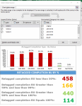
AM trying to a a new series to the data source that will change the color of the bar according to its %

For example if
Below 50% change the color to RED
Grater than 50 and less than 90 change the color to Yellow
greater than 90 and less than 100 change the color to Light Green
Equal 100 change the color to green
 

Attachments

  • Chart Data Source.PNG
    Chart Data Source.PNG
    176.5 KB · Views: 4

Excel Facts

Excel motto
Not everything I do at work revolves around Excel. Only the fun parts.

Forum statistics

Threads
1,215,039
Messages
6,122,799
Members
449,095
Latest member
m_smith_solihull

We've detected that you are using an adblocker.

We have a great community of people providing Excel help here, but the hosting costs are enormous. You can help keep this site running by allowing ads on MrExcel.com.
Allow Ads at MrExcel

Which adblocker are you using?

Disable AdBlock

Follow these easy steps to disable AdBlock

1)Click on the icon in the browser’s toolbar.
2)Click on the icon in the browser’s toolbar.
2)Click on the "Pause on this site" option.
Go back

Disable AdBlock Plus

Follow these easy steps to disable AdBlock Plus

1)Click on the icon in the browser’s toolbar.
2)Click on the toggle to disable it for "mrexcel.com".
Go back

Disable uBlock Origin

Follow these easy steps to disable uBlock Origin

1)Click on the icon in the browser’s toolbar.
2)Click on the "Power" button.
3)Click on the "Refresh" button.
Go back

Disable uBlock

Follow these easy steps to disable uBlock

1)Click on the icon in the browser’s toolbar.
2)Click on the "Power" button.
3)Click on the "Refresh" button.
Go back
Back
Top