Brain-Hurts
New Member
- Joined
- Mar 10, 2009
- Messages
- 2
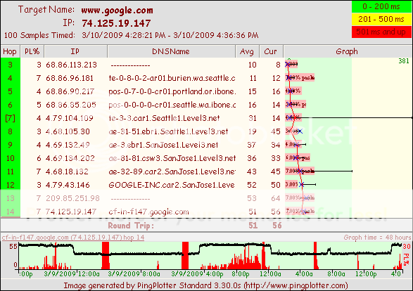
I have been tracking an intermittent problem with my internet by running a program called PingPlotter. It sends ping packets to a site and measures times and amount of loss through each hop.
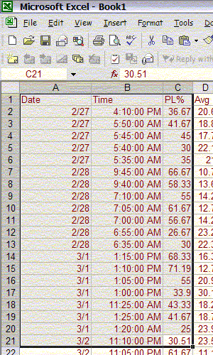
Data is sorted through a separate program that filters some of the extra stuff out and ends up in a csv file where I import it and filter out the boring stuff:
What I want to do is have a chart that shows what time of day the outages most likely occur. It would have to be an average of all of the times through all 2 weeks of readings.
What you see above is part of the data filtered to only show packet loss (PL% on the header) of 25% or greater. At this point the specific amount does not matter since they are all considered "outages." So I don't think they, or any of the other columns to the right (not shown) need to be in the graph.
Also, since it happens every day, I don't think the date columns (at least in the final chart) matter.
It would look like a 24 hour time scale on the X-axis, with a nice curve going horizontally with spikes in the times where the outage has occured the most in a 24 hour period.
For example, it always goes out at 4:30 ish in the morning and 12ish in the afternoon with random small outages at other times. The graph should be relatively even with spikes at 4:30 AM and 12 PM.
So, I think the only data I actually need is an aggregate of the time shown above plotted against a 24 hour scale.
I spent hours trying to figure this out! I am using Excel 2002.
Thanks!


