I will try my best to explain my problem.
I have the following data:
<tbody>
</tbody>
I have to now plot the points (see last column) something similar to the following:
Please note that the point plotting starts with the mean and goes from SD(minus) to SD(plus) depending on the points to plot. The first 3 columns will remain fix. I have to plot the points based on the 4th column (Points).
Any ideas how can I do this in Excel? Is there a better way to graphically represent what I want?
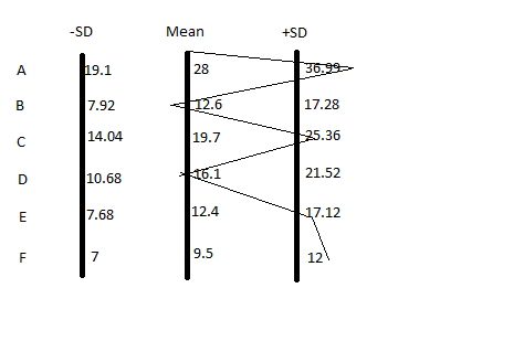
I have the following data:
| SD(minus) | Mean | SD(plus) | Points | |||
| A | 19.1 | 28 | 36.99 | 39 | ||
| B | 7.92 | 12.6 | 17.28 | 10 | ||
| C | 14.04 | 19.7 | 25.36 | 25 | ||
| D | 10.68 | 16.1 | 21.52 | 15 | ||
| E | 7.68 | 12.4 | 17.12 | 17 | ||
| F | 7 | 9.5 | 12 | 13 |
<tbody>
</tbody>
I have to now plot the points (see last column) something similar to the following:
Please note that the point plotting starts with the mean and goes from SD(minus) to SD(plus) depending on the points to plot. The first 3 columns will remain fix. I have to plot the points based on the 4th column (Points).
Any ideas how can I do this in Excel? Is there a better way to graphically represent what I want?


