Constructing a custom Y axis for a chart

hepp22

New Member
Joined
Aug 16, 2023
Messages
1
Office Version
  1. 365
Platform
  1. Windows
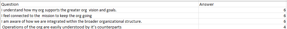
This might be a simple question but I am looking to make a bar graph using what is in the data picture
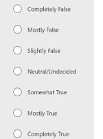
The scale I am looking to use is the second picture - with 1 being completely false and 7 being completely true. In the graph I am looking to have the graph show completely false at the bottom and completely true at the top for the Y Axis, how would I construct this graph so that I could then put it in a powerpoint
 

Attachments

  • Data.png
    Data.png
    8.3 KB · Views: 9
  • Scale.png
    Scale.png
    13.5 KB · Views: 9

Excel Facts

Pivot Table Drill Down
Double-click any number in a pivot table to create a new report showing all detail rows that make up that number

Forum statistics

Threads
1,215,069
Messages
6,122,954
Members
449,095
Latest member
nmaske

We've detected that you are using an adblocker.

We have a great community of people providing Excel help here, but the hosting costs are enormous. You can help keep this site running by allowing ads on MrExcel.com.
Allow Ads at MrExcel

Which adblocker are you using?

Disable AdBlock

Follow these easy steps to disable AdBlock

1)Click on the icon in the browser’s toolbar.
2)Click on the icon in the browser’s toolbar.
2)Click on the "Pause on this site" option.
Go back

Disable AdBlock Plus

Follow these easy steps to disable AdBlock Plus

1)Click on the icon in the browser’s toolbar.
2)Click on the toggle to disable it for "mrexcel.com".
Go back

Disable uBlock Origin

Follow these easy steps to disable uBlock Origin

1)Click on the icon in the browser’s toolbar.
2)Click on the "Power" button.
3)Click on the "Refresh" button.
Go back

Disable uBlock

Follow these easy steps to disable uBlock

1)Click on the icon in the browser’s toolbar.
2)Click on the "Power" button.
3)Click on the "Refresh" button.
Go back
Back
Top