Creating 0.45 Power Chart

jondavis1987

Active Member
Joined
Dec 31, 2015
Messages
443
Office Version
  1. 2019
Platform
  1. Windows
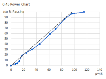
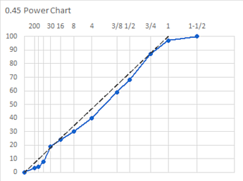
I can't provide specifics because I don't even understand what I'm trying to create really. Does anyone know how to create a .45 Power Chart? I'm trying to plot a gradation on a .45 chart. I have converted the square opening of the sieves from inches to microns. I have a different column that takes those microns to the .45 power. After that, i don't know what i'm doing.
 

Excel Facts

Can you AutoAverage in Excel?
There is a drop-down next to the AutoSum symbol. Open the drop-down to choose AVERAGE, COUNT, MAX, or MIN
Set up the data something like this:


Book1
BCDEF
2Sieve^45% PassingLine
31-1/2 in38100115.1904100#N/A
41 in2540095.9787797100
53/4 in1900084.2246387#N/A
61/2 in1270070.2605768#N/A
73/8 in951061.6852459#N/A
8No. 4476045.177640#N/A
9No. 8238033.0719430#N/A
10No. 16119024.2100724#N/A
11No. 3059517.7228119#N/A
12No. 5029712.964048#N/A
13No. 1001499.5045994#N/A
14No. 200746.9367223.1#N/A
15Pan0000
Sheet1


The Line column provides the straight line on the chart. It has two points: 100% passing at the maximum sieve opening, and zero at the intercept.

Select the rightmost three columns then, from the ribbon, select Insert > Scatter chart > Line with Markers.

The straight line was formatted to be a dashed line with no markers. If your chart does not connect the points for this series, with the chart selected go to the Design tab > Select Data. Click on the button labeled "Hidden and Empty Cells". Select "Connect data points with line" and OK your way out.

After some formatting, I end up with this:

kfI7qcN.png


With this second chart, I removed the x-axis and the vertical gridlines. I added a dummy series with no marker and no lines and used vertical error bars and data labels to show gridlines for the sieve sizes used.

IYbEKFM.png


My example spreadsheet can be downloaded from https://www.dropbox.com/s/ofk9064puut58yj/gradation_power_chart.xlsx?dl=0
 
Upvote 0
I am having trouble creating the second chart. I followed your intructions but I do not know how to do the gridline in error vertical bars. Please help.
 
Upvote 0
Go to format the chart. Go to the dummy series. Go to the error bar options for it. Click custom. Do 100% for positive and 0 for negative
 
Upvote 0

Forum statistics

Threads
1,215,374
Messages
6,124,574
Members
449,173
Latest member
Kon123

We've detected that you are using an adblocker.

We have a great community of people providing Excel help here, but the hosting costs are enormous. You can help keep this site running by allowing ads on MrExcel.com.
Allow Ads at MrExcel

Which adblocker are you using?

Disable AdBlock

Follow these easy steps to disable AdBlock

1)Click on the icon in the browser’s toolbar.
2)Click on the icon in the browser’s toolbar.
2)Click on the "Pause on this site" option.
Go back

Disable AdBlock Plus

Follow these easy steps to disable AdBlock Plus

1)Click on the icon in the browser’s toolbar.
2)Click on the toggle to disable it for "mrexcel.com".
Go back

Disable uBlock Origin

Follow these easy steps to disable uBlock Origin

1)Click on the icon in the browser’s toolbar.
2)Click on the "Power" button.
3)Click on the "Refresh" button.
Go back

Disable uBlock

Follow these easy steps to disable uBlock

1)Click on the icon in the browser’s toolbar.
2)Click on the "Power" button.
3)Click on the "Refresh" button.
Go back
Back
Top