Excel change horizontal axis in stacked bar graph

erin00

New Member
Joined
Jul 14, 2015
Messages
14
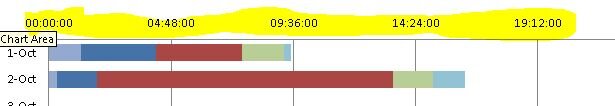
I have a table and a bar graph with dates and duration of each activity the graph looks good but the time label on horizontal line is wrong. how do i change this?

I attached what the graph looks like. I want it to be one hour interval (3:00 AM 4:00 AM 5:00 AM ...)

My data table only contain dates for the vertical axis and time durations for the bar on the graph.

Any advise?
 

Attachments

  • bargraph.JPG
    bargraph.JPG
    18.6 KB · Views: 12

Excel Facts

Copy a format multiple times
Select a formatted range. Double-click the Format Painter (left side of Home tab). You can paste formatting multiple times. Esc to stop

Forum statistics

Threads
1,214,987
Messages
6,122,614
Members
449,090
Latest member
vivek chauhan

We've detected that you are using an adblocker.

We have a great community of people providing Excel help here, but the hosting costs are enormous. You can help keep this site running by allowing ads on MrExcel.com.
Allow Ads at MrExcel

Which adblocker are you using?

Disable AdBlock

Follow these easy steps to disable AdBlock

1)Click on the icon in the browser’s toolbar.
2)Click on the icon in the browser’s toolbar.
2)Click on the "Pause on this site" option.
Go back

Disable AdBlock Plus

Follow these easy steps to disable AdBlock Plus

1)Click on the icon in the browser’s toolbar.
2)Click on the toggle to disable it for "mrexcel.com".
Go back

Disable uBlock Origin

Follow these easy steps to disable uBlock Origin

1)Click on the icon in the browser’s toolbar.
2)Click on the "Power" button.
3)Click on the "Refresh" button.
Go back

Disable uBlock

Follow these easy steps to disable uBlock

1)Click on the icon in the browser’s toolbar.
2)Click on the "Power" button.
3)Click on the "Refresh" button.
Go back
Back
Top