RockandGrohl
Well-known Member
- Joined
- Aug 1, 2018
- Messages
- 790
- Office Version
- 365
- Platform
- Windows
Hello all,
Is it possible to create a line chart with points of interest? Let's say I use this data:
<tbody>
</tbody>
So I'd have a line chart as you expect, but I want to have markers on it so I can try and correspond the events to the dates and hopefully draw a pattern that a mailing or email results in more bookings on the line chart.
I'm getting stuck with A) Having all dates across the screen instead of a compressed 1st, 4th, 7th, 10th etc view, and B) Actually putting the labels in.
Ideally I'd want them labelled across the top, aligned with the date and then a marker on the actual line itself.
Any ideas if this is possible? Thanks.
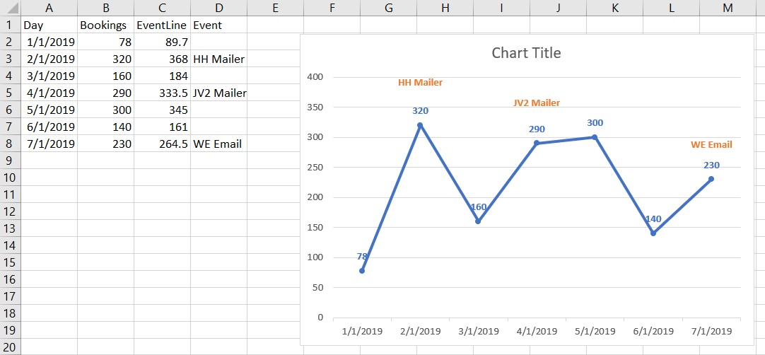
Is it possible to create a line chart with points of interest? Let's say I use this data:
| Day | Bookings | Event |
| 1/1/2019 | 78 | |
| 2/1/2019 | 320 | HH Mailer |
| 3/1/2019 | 160 | |
| 4/1/2019 | 290 | JV2 Mailer |
| 5/1/2019 | 300 | |
| 6/1/2019 | 140 | |
| 7/1/2019 | 230 | WE Email |
<tbody>
</tbody>
So I'd have a line chart as you expect, but I want to have markers on it so I can try and correspond the events to the dates and hopefully draw a pattern that a mailing or email results in more bookings on the line chart.
I'm getting stuck with A) Having all dates across the screen instead of a compressed 1st, 4th, 7th, 10th etc view, and B) Actually putting the labels in.
Ideally I'd want them labelled across the top, aligned with the date and then a marker on the actual line itself.
Any ideas if this is possible? Thanks.
")