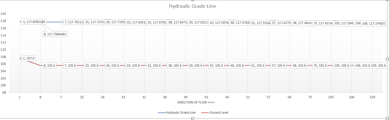
Hi please have a look at the screen short of the following chart.
What I need is to make labels in round figures so that it may not show up messy and overlapping each other.
Any suggestion would be appreciated.
Thanks
EDIT : Rounding the cell ( column) does not have any effect on labels figures.
What I need is to make labels in round figures so that it may not show up messy and overlapping each other.
Any suggestion would be appreciated.
Thanks
EDIT : Rounding the cell ( column) does not have any effect on labels figures.
Last edited:
")


