conditioning color in line and clustered column chart

alhq

New Member
Joined
Mar 29, 2021
Messages
2
Office Version
  1. 365
Platform
  1. Windows
Hello!
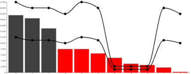
I am quite new to Power BI. i would like to know if it is possible to have color conditioning in the line and clustered column chart. For example, when the column chart is below the line, it changes to red, but when it is above the line, it change to green.

thanks.
 

Excel Facts

Best way to learn Power Query?
Read M is for (Data) Monkey book by Ken Puls and Miguel Escobar. It is the complete guide to Power Query.
created another chart. However, the colors are not right. Is it possible to change the color?

the chart is a column chart with upper and lower bounds.
 

Attachments

  • pZh0b.png
    pZh0b.png
    44.2 KB · Views: 8
Upvote 0

Forum statistics

Threads
1,215,102
Messages
6,123,097
Members
449,096
Latest member
provoking

We've detected that you are using an adblocker.

We have a great community of people providing Excel help here, but the hosting costs are enormous. You can help keep this site running by allowing ads on MrExcel.com.
Allow Ads at MrExcel

Which adblocker are you using?

Disable AdBlock

Follow these easy steps to disable AdBlock

1)Click on the icon in the browser’s toolbar.
2)Click on the icon in the browser’s toolbar.
2)Click on the "Pause on this site" option.
Go back

Disable AdBlock Plus

Follow these easy steps to disable AdBlock Plus

1)Click on the icon in the browser’s toolbar.
2)Click on the toggle to disable it for "mrexcel.com".
Go back

Disable uBlock Origin

Follow these easy steps to disable uBlock Origin

1)Click on the icon in the browser’s toolbar.
2)Click on the "Power" button.
3)Click on the "Refresh" button.
Go back

Disable uBlock

Follow these easy steps to disable uBlock

1)Click on the icon in the browser’s toolbar.
2)Click on the "Power" button.
3)Click on the "Refresh" button.
Go back
Back
Top