Yeah, I understand. I used to have a boss. Actually, a few different ones on different occasions.
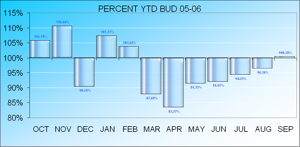
I think the background is still a part of the chart that you need to address. Could you use a solid color or a simple gradient for the background? All this shiny reflective stuff is obnoxious.
Also, is there a reason other than being fancy for coloring the points for alternate months in different colors? It implies different data sets, which is probably not the case.
Another point: It's misleading to use columns that start at a value other than zero. You're using 100% as the basis instead of zero. If your intention is to show deviation from budget, subtract 100% and show columns which clearly represent percent above and below budget. In this case it would be fine to use different color columns for above and below budget.
Bottom line:
Don't do anything to confuse the viewer or to obscure or misrepresent any of the data.