Hi everyone.
I'm trying to create a graph, but I think I had a brain fart or something, cause I can't figure out how to, and I'm sure it's a very simple one.
The data I have is number of orders for 3 vendors rejected and ok, for two months. Something like:
<colgroup><col><col><col><col><col></colgroup><tbody>
</tbody>
The graph I want to do is super simple. A pie with only two colors for "Rejected" and "Ok", and two slices to filter between vendors and months.
Can anyone help, please?
Thank you
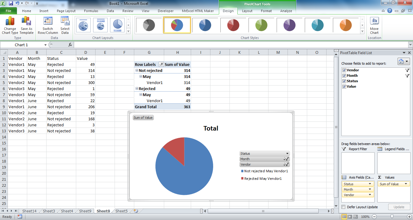
I'm trying to create a graph, but I think I had a brain fart or something, cause I can't figure out how to, and I'm sure it's a very simple one.
The data I have is number of orders for 3 vendors rejected and ok, for two months. Something like:
| Vendor | Month | Rejected | Not rejected | Total of orders |
| Vendor1 | May | 49 | 314 | 363 |
| Vendor2 | May | 13 | 300 | 313 |
| Vendro3 | May | 1 | 59 | 60 |
| Vendor1 | June | 22 | 206 | 228 |
| Vendor2 | June | 19 | 168 | 187 |
| Vendor3 | June | 3 | 38 | 41 |
<colgroup><col><col><col><col><col></colgroup><tbody>
</tbody>
The graph I want to do is super simple. A pie with only two colors for "Rejected" and "Ok", and two slices to filter between vendors and months.
Can anyone help, please?
Thank you