How to make this Infograph

naveeddil

New Member
Joined
Nov 5, 2015
Messages
46
Office Version
  1. 365
Platform
  1. Windows
Dear Experts,
Can you please guide me how to make this kind of infographic in Excel or if it is not excel so what tool could be used to design one like such (attached)

infographic.png
 

Excel Facts

How to total the visible cells?
From the first blank cell below a filtered data set, press Alt+=. Instead of SUM, you will get SUBTOTAL(9,)
While we do not prohibit Cross-Posting on this site, we do ask that you please mention you are doing so and provide links in each of the threads pointing to the other thread (see rule 13 here along with the explanation: Forum Rules). This way, other members can see what has already been done in regards to a question, and do not waste time working on a question that may already be answered.
 
Upvote 0
While we do not prohibit Cross-Posting on this site, we do ask that you please mention you are doing so and provide links in each of the threads pointing to the other thread (see rule 13 here along with the explanation: Forum Rules). This way, other members can see what has already been done in regards to a question, and do not waste time working on a question that may already be answered.


Copied!
I didn't knew about any such rule. Thank you for pointing out to me.
 
Upvote 0
Yes, it can be done in Excel. The time rquired would depend. on your experience with charts and Excel's drawing tools. If you attempt it you'll learn a lot.

Here's a quick rundown on how I would do it. This is not a tutorial, just some hints.

First four rows would be titles and column headers.

In the table, each display row would be 3 Excel rows,
First display column is two Excel columns. Pictures sized to fit 3 rows high.
Second column is just text in a cell.

You could do the bubble chart as just a bubble chart, but if you want ellipses, you'll have to use shapes.
I'd allocate five columns, fifteen rows for the bubbles.

Shapes, in Excel 2016, are available from the Insert ribbon tab. Any shape can act as a text box. I'd set the first shape to the proportions and colors I want. From the format pane, set the text checkbox for "Allow text to overflow shape;" unset "Resize text to fit shape" and unset "Wrap text in shape". Text boxes can be linked to cells so you don't have to type the text into the shape directly.

I would copy the ellipse 24 times. Quick copy tip: start dragging the shape with your mouse. After the drag has started, press Ctrl. Finish the drag to a new position, lift up on the mouse button first, then let go of the Ctrl key. From the format pane, lock the shapes aspect ratio and adjust the shape size to the correct percentage.

The stacked bar charts could be made to size, but that would be too finicky for me. I'd probably make the charts at a convenient size and use a picture snipping tool, either Windows built-in or Greenshot, and paste a picture of the appropiate bar chart. Then resize the pictures. The labels could be done as regular text in a cell.

The last column of bar charts could be done as conditional formatting data bars. One cell for the label, one cell for the bar with the text for the bar chart cell hidden.


Other tips:

You might find the camera and the Nudge tools useful. To access them you have to add them to the Quick Access Toolbar. They are listed under "Commands not in the ribbon".

The Selection tool allows you to lasso groups of shapes, so you can act on all of them simultaneously. Escape ungroups the selected shapes. The tool is found on the Home tab under "Find & Select." It's a little faster than grouping from the drawing tools tab. I sometimes put the Selection tool on the QAT.

You'll need the Alignment tools from the Drawing Tools Format tab frequently.

I know there's a snap-to-grid menu item somewhere on the ribbon. I never use it. If you hold down the Alt key while you're resizing or moving a shape, the shape edges will snap to the cell grid.

Holding down Shift while moving a shape restricts your movement to strictly horizontal or vertical. Useful when, say, the shape is perfectly placed in the horizontal and you just want to tweak the placement vertically. Or the other way around. The nudge tools let you get finer control over shape placement than I've ever been able to achieve with a mouse.

When you cut or copy a shape, if you select a cell as the destination, then paste with Ctrl+v, the top and left edges of the shape are placed exactly on the top edge and left edge of the destination cell. This can be a convenient way to quickly align objects.

Remember, charts are shape objects, too.

If you want to manipulate cells and the shapes are in the way, press Ctrl+6. The shapes will disappear. Press Ctrl+6 again and the shapes reappear.

I honestly don't know if I should encourage or discourage you from this project. It would take me quite a few hours to recreate the display. But I struggle with time management for I'm too often a perfectionist.

If you aren't under a deadline, go ahead and try to recreate the graphic. If you have a deadline, get something usable and ready to submit first, then work on the vanity project.

Good luck and happy learning.
 
Last edited:
Upvote 0
Yes, it can be done in Excel. The time rquired would depend. on your experience with charts and Excel's drawing tools. If you attempt it you'll learn a lot.

....

Good luck and happy learning.

Dear thisoldman!

Thank you for wonderful tips and encouragement, I have worked around and made a shape of it. Instead of snipping tools i've made everything builtin even the Graphs. So that as some values change so graphs update itself inside each cell.

Although, I came to a block situation with Bubbles. I have inserted Icon Sets right now whereas i want to have Bubbles and if the data change inside the cell so rest of the Bubbles should adjust themselves as we experience in DATA BARS in conditional formatting.

Below is the revised look!

Can you please guide.

infograph_Update.png
 
Last edited:
Upvote 0
Looks like you're well on your way. I'm pretty sure you'll keep visiting the work for the next several days to "fix" parts of it. Well, that's the way I work.

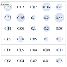
Here's a bubble chart. Or is it a bingo card?
k1yuDv0.png


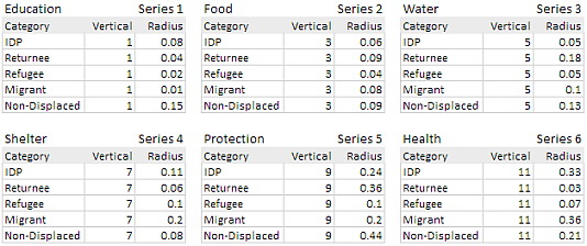
I organized the data into six different tables:

tHcRGIJ.png


The spreadsheet may be downloaded from:
https://www.dropbox.com/s/49ex43ryjw5sg6q/bubble_matrix.xlsx?dl=0

I selected the data for the first series, the lowest row, and inserted a bubble chart using the ribbon. From the chart right-click context menu, "Select Data..." >> "Edit", I fixed the series name by pointing it to the correct cell. Then I used that same "Select Data.." dialog box to add each series, one by one. Only mildly tedious work.

I changed the chart size to 5-inches by 5-inches so I had enough room for sloppy mouse handling. I also deleted the chart title.

The horizontal axis is a category axis; the bubble centers were aligned to the whole numbers 1, 2, 3, 4, and 5. I changed the horizontal axis scale to 0.5 minimum, 5.5 maximum, and 1.0 as the major unit. The vertical axis is a value axis. Minimum is zero, maximum is zero, and the major unit is 2. These changes centered the circles within each grid rectangle. I then deleted both axes.

The largest bubbles spilled out over the gridlines. I wanted them contained within the grid squares. To fix that, I selected a series and using the format pane, I changed the "Scale bubble size" from 100 to 56.

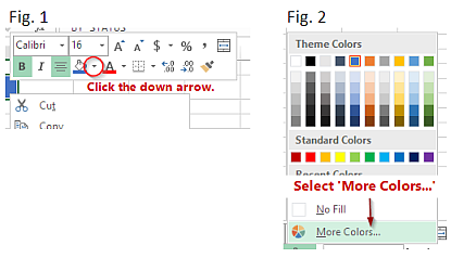
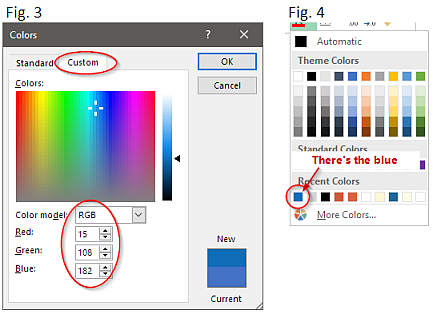
It's easiest if you format the series markers before adding the data labels. I selected the first series and changed the color to a light blue. I immediately selected the second series and pressed Ctrl+y (for repeat) and the second series was colored light blue. I then continued the Ctrl+y action with each series.

I added the data labels by clicking the check box from the chart's plus-icon menu. Each series labels had to be set. I set the label to show "Bubble Size" and all other label check boxes were unset.

I deselected the last set of series labels and selected the entire chart. Since there was no text except for the labels, I went to the "Home" tab and changed the font for the entire chart to Calibri Light, 20 point.

That was it. I was done.
 
Upvote 0
Dear,
Thank you for your time and helping me out. Indeed there is so much for me to learn from this and i'm watching Matrix Chart for the first time. Your all tips are valuable for me. As you rightly mentioned that I'll be sorting it and working on it to fine tune it although I'm attaching the initial final sheet that i came to a conclusion. No doubt i'm going to work on its designing and further fine tuning.

Here is the link:
https://www.dropbox.com/s/d4fa89alp7sbcm1/InfoGraphic Final.xlsx?dl=0

Your further valuable suggestions are appreciated.
 
Upvote 0
You've done a remarkable job. You've probably learned a lot in a few days.

I'm not a designer or professional artist–feel free to disregard any of this.

If this were handed to me, I would first unify the titles. Some are in all uppercase, some are in title case. Decide which case you want for a particular set of titles and make the others match: all capitals or all title case.

The same blue should be used everywhere. The one blue you would have the most difficulty changing is the blue used in the icons in the first column. It's RGB values are 15, 108 182. So use that blue for anything you want in blue.

You may know the material in this mini tutorial. I've included it just in case it's useful.

To add the blue to your available palette for the workbook, we can change the fill color for cell D5, the one that has the value "By Status".

With D5 selected, right-click on it to bring up the context menu and the mini-toolbar. Click on the down arrow to the right of the paint bucket, see Fig. 1. From the pop-up menu select "More Colors...', Fig. 2.

cQSwQ1t.png


In the next pop-up, "Colors", select the "Custom: tab. The "Color model" should be set to RGB. Plug in the values Red: 15, Green: 108, Blue: 182, and press OK. See Fig. 3. You can now copy that cell and paste the format to the other cells with blue fills.

When you go to change the font color and the cell border colors, the blue you just used should be available from the color selector under "Recent Colors", Fig. 4.

bHplP37.png


Similarly, I think you should use only one shade of gray for all your charts.
 
Upvote 0
Here's my edit of your file; https://www.dropbox.com/s/t6duy21jm1vbpuk/Copy of InfoGraphic Final.xlsx?dl=0

Did anyone mention that people who use Excel a lot hate merged cells?

Actually, professionals might do the charts in Excel but the majority of the work would be done in Adobe Illustrator. If I was preparing this for print, on my budget, I would do the charts in Excel and use Inkscape for arranging the artwork and finally Scribus for electronic typesetting.
 
Upvote 0

Forum statistics

Threads
1,215,409
Messages
6,124,730
Members
449,185
Latest member
ekrause77

We've detected that you are using an adblocker.

We have a great community of people providing Excel help here, but the hosting costs are enormous. You can help keep this site running by allowing ads on MrExcel.com.
Allow Ads at MrExcel

Which adblocker are you using?

Disable AdBlock

Follow these easy steps to disable AdBlock

1)Click on the icon in the browser’s toolbar.
2)Click on the icon in the browser’s toolbar.
2)Click on the "Pause on this site" option.
Go back

Disable AdBlock Plus

Follow these easy steps to disable AdBlock Plus

1)Click on the icon in the browser’s toolbar.
2)Click on the toggle to disable it for "mrexcel.com".
Go back

Disable uBlock Origin

Follow these easy steps to disable uBlock Origin

1)Click on the icon in the browser’s toolbar.
2)Click on the "Power" button.
3)Click on the "Refresh" button.
Go back

Disable uBlock

Follow these easy steps to disable uBlock

1)Click on the icon in the browser’s toolbar.
2)Click on the "Power" button.
3)Click on the "Refresh" button.
Go back
Back
Top