Couple of questions...I apologize but I am trying to learn from this.
1) Why when you select data does yours have check boxes?
2) How did you determine the bounds and units?
I'll take the
second question first—it's easier to answer. For dates and times I usually adjust the major unit first and see where Excel puts the minimum and maximum automatically. Only then do I adjust these last two settings.
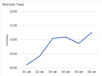
For the response time axes, I knew the response times were all under 15 minutes. A reasonable major unit seemed to be 5.0 minutes. I typed 00:05:00 into a cell and Excel recognized the entry as a time. I changed the cell format to "General" and copied the number displayed into the text box for the axis' Major Units.
I may have set some of these response time axes limits to manual as I was playing around. They don't need to be set to manual. Excel sets the minimum to zero for these charts and selects its own maximum.
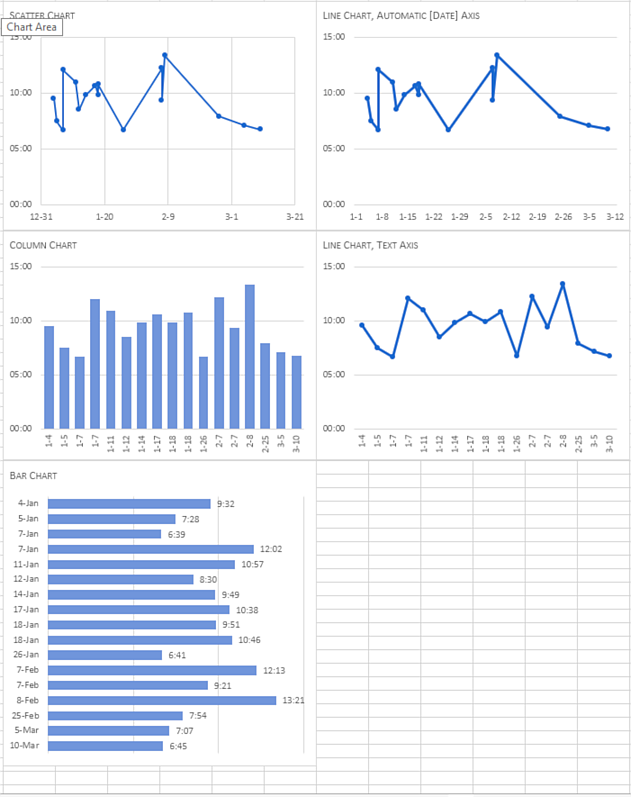
For the date axes on the scatter and line charts, one week is a good division so 7 was entered as the major unit. The minimums and maximums were then adjusted to where there would be an even division displayed.
On the column and bar charts, I set the response time major units. For the bar charts, after the response time axis looked good, I decided I didn't need the axis on the chart. With that axis selected, I pressed the Delete key. Excel let the grid lines remain displayed. I thought the grid lines would help people read the charts, make comparisons, so I did not remove them.
First question: check boxes? When you select data? I'm not quite sure what you mean: perhaps the Charting Tools icons?
For Excel 2013 and later, if I select a chart or any item within a chart, three icons appear to the right of the chart. The plus icon, when clicked, brings up a menu that allows me to quickly toggle on or off chart elements. If I hover on an item, a rightward pointing arrow (gray triangle) appears. If I click on that arrow, a flyout menu appears where I have a little bit more control over which items should appear on the chart.
The Paintbrush icon is where I can go to quickly choose one of the builtin styles or one of the preset colors. I don't like Excel's presets.
The filter icon, lets you fine tune the data to display in the chart. I forgot that this menu is available. I usually separate raw data from charted data: separate data blocks on the same worksheet or separate worksheet. The way I work, I have usually filtered the data before I insert a chart.
There are many good websites to learn about excel charts. When I first started trying to improve my charts, I visited Purna Duggirala's website,
https://chandoo.org/, a lot. For help with specific problems, Jon Peltier's blog,
https://peltiertech.com/, is great. Charley Kyd's blog,
http://www.exceluser.com/index.htm, has also proved helpful. And finally, I find I visit Jorge Camões site often,
https://excelcharts.com/.