vba to change colour of pie chart segment based on cell value

cjcass

Well-known Member
Joined
Oct 27, 2011
Messages
680
Office Version
  1. 2016
Platform
  1. Windows
Hi,
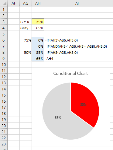
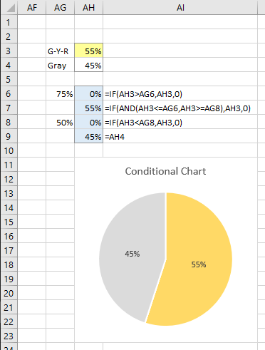
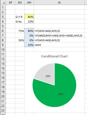
I have a simple 2 segment pie chart (Chart 33) located in a wksht named 'Results'. Its source data is in cells AH3:AH4 (percentages) in a wksht named 'Data'.
AH3 contains the result, eg.65% and AH4 balances it to 100% (eg.35%). When AH3 is less than 50% I would like it's segment to be RED and when above 75% GREEN and anything in between AMBER. I would like to use RGB codes for the colours. The segment reading from AH4 needs to stay GREY. I can change the codes accordingly using the RGB's.
Can anyone help with this?
Many thanks.
 

Excel Facts

When did Power Query debut in Excel?
Although it was an add-in in Excel 2010 & Excel 2013, Power Query became a part of Excel in 2016, in Data, Get & Transform Data.
ok, sussed it...
If Target.Address = "$C$12" Then
ActiveSheet.ChartObjects("Chart 33").Activate
If Sheet24.Range("P3").Value < 0.5 Then
ActiveChart.SeriesCollection(1).Points.Item(1).Interior.Color = RGB(0, 118, 115)
End If
 
Upvote 0
You don't need VBA, you can do this with some pretty easy formulas which will update automatically without the need to rerun any code. This uses a variation of the Conditional Formatting of Excel Charts tutorial on my web site.

I'm going to make a chart with four segments: gray, red, yellow, and green. Depending on the value of AH3, the gray wedge and only one of the colored wedges will appear.

See the data layout below. Cells AH3 and AH4 are as you describe: AH3 which contains the changing value is shaded yellow. I've used a few more cells to set up the data for the chart. The four blue cells AH6:AH9 are those plotted in the chart. The formulas appear next to these cells in AI6:AI9. The cut-off values of 75% and 50% are in AG6 and AG8 so you can adjust them easily if necessary.

Use a custom number format of 0%;;; to hide zero value labels in the chart.

You can see how the formulas will change based on the value in AH3. Here is the range and chart when AH3 is less than the lower bound, and the pie segment is red:

j67wNYV.png


Next, AH3 is between the two bounds, so the pie segment is yellow:

pGHYuKv.png


Finally, AH3 is greater than the upper bound, and the pie slice is green:

pGtU4lB.png
 
Last edited:
Upvote 0

Forum statistics

Threads
1,215,327
Messages
6,124,280
Members
449,149
Latest member
mwdbActuary

We've detected that you are using an adblocker.

We have a great community of people providing Excel help here, but the hosting costs are enormous. You can help keep this site running by allowing ads on MrExcel.com.
Allow Ads at MrExcel

Which adblocker are you using?

Disable AdBlock

Follow these easy steps to disable AdBlock

1)Click on the icon in the browser’s toolbar.
2)Click on the icon in the browser’s toolbar.
2)Click on the "Pause on this site" option.
Go back

Disable AdBlock Plus

Follow these easy steps to disable AdBlock Plus

1)Click on the icon in the browser’s toolbar.
2)Click on the toggle to disable it for "mrexcel.com".
Go back

Disable uBlock Origin

Follow these easy steps to disable uBlock Origin

1)Click on the icon in the browser’s toolbar.
2)Click on the "Power" button.
3)Click on the "Refresh" button.
Go back

Disable uBlock

Follow these easy steps to disable uBlock

1)Click on the icon in the browser’s toolbar.
2)Click on the "Power" button.
3)Click on the "Refresh" button.
Go back
Back
Top