Vertical Sparklines Bar Graph linked to cells - can you change Max value, using a Cell Reference ?

StrawberryDreams

Board Regular
Joined
Mar 26, 2022
Messages
75
Office Version
  1. 365
Platform
  1. Windows
  2. MacOS
  3. Mobile
I found an interesting way to create a Vertical bar like graph using sparklines instead of trying to physically drag and overlay a Table bar graph chart to line up with column cells.

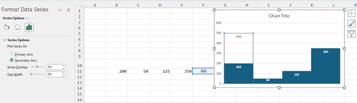
I am wondering if there is a way to add a cell reference to the Maximum Value in the Vertical Sparklines Axes setting? I tried to enter an = A2 and it will only accept integers...

I can make a guess what the max value will be , but it would be more dynamic if it could adjust as the values change. Is this possible ?
Secondly I noticed in the Change sparklines color that the weight line option is greyed out, Is this because I'm on a MAC and it's only available for Windows ? Would love if the bars could fill the entire width of the column ( visually no gaps between columns ).

the xl2bb did not copy over the sparklines properly. I will post a screenshot of what it looks like too.

Basic data calculator test 9.9b.xlsm
ABCDE
1MAX Value20050125350
2350
3
4
5
6
7
8
9
10500 is the set Maximum Value I placed in sparklines Vertical Axes
Sheet1
Cell Formulas
RangeFormula
A2A2=MAX(B1:E8)


1715019422635.png
 

Excel Facts

Can a formula spear through sheets?
Use =SUM(January:December!E7) to sum E7 on all of the sheets from January through December
Not sure if this is what you seek. But, this has a second data series with only the one value (500 and it could be changed to a formula).
formatted as below. Format the column as no fill.
(I used data labels and the border for illustration purposes).

1715021314517.png


1715021355820.png


1715021075866.png
 

Attachments

  • 1715020915478.png
    1715020915478.png
    43.1 KB · Views: 1
Upvote 0
Not sure if this is what you seek. But, this has a second data series with only the one value (500 and it could be changed to a formula).
formatted as below. Format the column as no fill.
(I used data labels and the border for illustration purposes).


View attachment 111029
This is pretty cool, And good to know how to do that with charts if I resort back to that way. The reason why I don't want to use chart is trying to drag the chart handles to get the width of each bar to line up with the width of the cell is not exact. You can see in your example that the 200 value spans the width of G& H columns, It would be nice to have it span only one column width, so that if I have the 200 in cell G15, the bar chart graph would line up to that.
 
Upvote 0
This is pretty cool, And good to know how to do that with charts if I resort back to that way. The reason why I don't want to use chart is trying to drag the chart handles to get the width of each bar to line up with the width of the cell is not exact. You can see in your example that the 200 value spans the width of G& H columns, It would be nice to have it span only one column width, so that if I have the 200 in cell G15, the bar chart graph would line up to that.

It is tricky, but you can do it. And setting the references for the series in each chart is tedious.
But, you can drag and place the chart into a cell. Just make one chart. Then select the "Plot" area and drag it to fill all of the "Chart" area.
Do not use gridlines, axes, or any other items of the chart. only the plot area and chart area, and series plots.
Here, I copied the first series onto a new line and and changed the data around. You'll have to format each chart though.

1715022283215.png
 
Upvote 0
It is tricky, but you can do it. And setting the references for the series in each chart is tedious.
But, you can drag and place the chart into a cell. Just make one chart. Then select the "Plot" area and drag it to fill all of the "Chart" area.
Do not use gridlines, axes, or any other items of the chart. only the plot area and chart area, and series plots.
Here, I copied the first series onto a new line and and changed the data around. You'll have to format each chart though.

View attachment 111034
But the chart is still placed to the right of your data, I guess what your saying which you didn't show is to drag the chart above the data : 200 50 125 350 and drag the chart box to the size of the cells. I did this before but without using the max cell reference you showed prior.

This is what I have . The left side of the image uses sparklines ( the ones with gaps ) , the right side values with the Umols uses a standard bar chart which I had to stretch to fit. It's pretty good but would like to know if the individual bars could be linked to the cell, ( less dragging ) . Maybe there will be tradeoffs with either way.

1715023185488.png


1715023289770.png


I think the other reason I was hoping to combine the look of the bar chart with the way the sparklines work is It's easier to assign colours to the cell. I've had so many charts that I've spent assigning custom colours too go and change their color and resort to default colours randomly.
 
Last edited:
Upvote 0
Whoa. I'm confused now. Are you saying you only want the chart based on only one value (and the fixed reference value)?
 
Upvote 0
Whoa. I'm confused now. Are you saying you only want the chart based on only one value (and the fixed reference value)?
I'm playing around with different ways to visualize the data. I have a row of cells with values I want to be turned into a visual data representation.
-I would like the Cell value in the cell to remain as an indicator of the numerical value of the visual representation. ( this is the row in teal color)
-I want the way I created the sparkling representations in cells W to AE columns ( I only made those columns as sparklines )

to look like the chart in AH to AP which is another style I created to visual the data in the teal coloured row.

- I prefer the "look" of the chart in AH to AP but I don't like how it can get moved around, and was wondering if I could do something similar where the values are locked to each cell individually . I have a felling I have to choose one way or another.
 
Upvote 0
You could try this:
1715024299539.png


I suggest alos looking at MyOnlineTrainingHub YouTube channel. They have lots of videos on visualizations.

Just a note. Merged cells are anathema to many excel users.
What I have above is also very clunky. Each copy and paste needs to be edited.
 
Upvote 0
Solution
You could try this:
View attachment 111038

I suggest alos looking at MyOnlineTrainingHub YouTube channel. They have lots of videos on visualizations.

Just a note. Merged cells are anathema to many excel users.
What I have above is also very clunky. Each copy and paste needs to be edited.
Oh this is nice ! is this using sparklines ? Is it possible to add an outline to the coloured bars too ?
 
Upvote 0

Forum statistics

Threads
1,216,102
Messages
6,128,851
Members
449,471
Latest member
lachbee

We've detected that you are using an adblocker.

We have a great community of people providing Excel help here, but the hosting costs are enormous. You can help keep this site running by allowing ads on MrExcel.com.
Allow Ads at MrExcel

Which adblocker are you using?

Disable AdBlock

Follow these easy steps to disable AdBlock

1)Click on the icon in the browser’s toolbar.
2)Click on the icon in the browser’s toolbar.
2)Click on the "Pause on this site" option.
Go back

Disable AdBlock Plus

Follow these easy steps to disable AdBlock Plus

1)Click on the icon in the browser’s toolbar.
2)Click on the toggle to disable it for "mrexcel.com".
Go back

Disable uBlock Origin

Follow these easy steps to disable uBlock Origin

1)Click on the icon in the browser’s toolbar.
2)Click on the "Power" button.
3)Click on the "Refresh" button.
Go back

Disable uBlock

Follow these easy steps to disable uBlock

1)Click on the icon in the browser’s toolbar.
2)Click on the "Power" button.
3)Click on the "Refresh" button.
Go back
Back
Top