Construct boundaries (as a polygon) in excel chart for a custom data

ajaysomasi

New Member
Joined
Mar 6, 2017
Messages
25
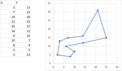
Hi, I have a task to construct polygon boundaries for specific data.. Have a large number of such polygons to construct hence any help as a VBA or directly in excel is much appreciated. I was trying to construct a polygon using scatter plot but the lines are joining to points that will form a boundary. I tried sorting the data to bring a polygon, but guess I'm missing something.. VBA should help but cant code.. I need a standard code that I can run as there are many such boundaries to be constructed.

Datapoints are shown below.. Please help..

-Ajay

X
Y
6
10
10
7
7
15
3
13
25
15
14
12
8
4
21
31
14
16
2
5

<tbody>
</tbody>
 
You may be ritht. I just wanted to see how a formula solution would be.
I tried with random values for several times and it worked OK and I was satisfied.
I know that I did a light testing and so there may be cases that won't work, but I don't have time now to test it further.

I did most of the earlier testing with source coordinates generated by =RANDBETWEEN(1,10).
When it worked OK I then tried other random generated coordinates and it also worked OK.

I now did a quick test with coordinates in A2:B30 generated by:

Case 1: =RANDBETWEEN(0,10)
Case 1: =RANDBETWEEN(-10,0)
Case 1: =RANDBETWEEN(-10,10)

For each of these cases I hit F9 25 times and had no errors.

Unfortunately I am caught up during this month with bad things, like inventory (I need here an emoticon like :( but 100 times bigger) and don't have time to think about more testing or corrections.

I would be thankful if you would post 1 or several sets of coordinates that cause the formulas to fail.
I would try to come back here next month when I'll have more time (hopefully) and do the corrections.

Anyway thank you for trying it, this will clarify the scope of the solution.

... or, in the meanwhile someone will post a simpler solution that always works. :)
 
Upvote 0

Excel Facts

Why are there 1,048,576 rows in Excel?
The Excel team increased the size of the grid in 2007. There are 2^20 rows and 2^14 columns for a total of 17 billion cells.
That's great.
If, however, you or someone find a set of values for which it does not work please post it.
 
Upvote 0
pgc01 - nice work, thanks for posting.

I'm trying to follow this just out of curiosity, and am struggling to make it work - I am sure this is because I am doing something wrong, but can't figure out what it is.

I've got the formulas set up and I'm getting results similar to pgc01's first post (obviously randomised, and I am just using =RAND(), so generating values between 0 and 1).
To begin with, I'm only using positive values.
I've set up the range names as well, and I think correctly.

My problem comes when I try and set up the charts.
I have to admit, I haven't created charts in the past using named ranges for the source data - this might be where I am going wrong.
All I get, for both charts, is a single data point located at 1 on the X azis and 0 on the Y axis.

In the "Edit Series" dialog box within the "Select Data ..." chart dialog box . . .
The Series X Values are registered like this . . .
Code:
={"X_Scr"}

and the Series Y values are registered like this . . .
Code:
={0}

I've tried various ways of trying to force the Y value to be registered as something like
Code:
={"Y_Scr"}
but it just won't take.

I'm sure I'm making a stupid mistake - can anyone point out what it is please ?

Thanks in advance !
 
Upvote 0
Hi Gerald

I defined the named ranges as worksheet named ranges.

I have for the first series:

Series X Values:
=Sheet1!X_Src

Series Y Values:
=Sheet1!Y_Src

Just the addresses of the named ranges, no double quotes or parentheses

For the second series it's similar
 
Upvote 0
P. S. also, just in case it was a typo, I used X_Src (Src from "Source") , not X_Scr
 
Upvote 0
Thanks pgc01, I've got it now.

My ranges had been setup as WORKBOOK instead of WORKSHEET, when I deleted the original ones and re-created as worksheet, and then re-created the chart data series as you described, it worked !

Thanks very much.

Now to try and find out what the significance of WORKBOOK v WORKSHEET range names is . . . .

And then to try and work out how exactly this solution works :)
 
Upvote 0
I'm glad it worked OK.

Remark: about the named ranges, it would also work with workbook named ranges. I used worksheet named ranges because I wanted the same name in 2 different worksheets for the testing.
 
Upvote 0
There's been a huge amount of speculative and highly theoretical discussion here, without any follow-up from the OP. Here's my take on what seems to me like a much simpler question than others have assumed.

It's common, and relatively easy, to use a series of XY points to draw a polygon to surround a region on a chart. the points have to be placed in a logical order, so consecutive points define segments of the surrounding polygon, and so the last point has the same X,Y coordinates as the first, to close the polygon.

I took the original points, rearranged them in one particular order that makes a reasonable outline, duplicated the first point as the last, and drew a chart:

ZJWR536.png


To make this chart, select the data, and insert an XY Scatter Chart. I used the lines and markers subtype, but for this purpose, the lines only option is probably best. Do not insert a Line chart, because it will not treat the X values as actual numbers.

to add this data to an existing chart (i.e., to surround points already plotted), select the data and copy it, then select the chart, and use Paste Special on the Home tab of the ribbon, to add the data as a new series, categories (X values) in the first column, series names in the first row.
 
Upvote 0
Hi Jon

Sorry, that's not what we are trying to do here.

What we want is not just to surround the points with a polygon, I agree with your that it may be relatively easy to use a series of XY points to draw a polygon to surround a region on a chart.

What we are trying here is another thing, it's to surround a cluster of points in the plan with the smallest convex polygon.

I guess that the problem is that, for the purposes of testing, we just used 10 or 20 points, and so it may not be clear what we are doing.

If you imagine that you have, for example, 10,000 points you'll see that it would not be useful at all just to connect them.

In the case you posted the polygon hull would have the points:

2 5
8 4
25 15
21 31
3 13
2 5

Just change the chart type of your series to just scatter and add this new series with type scatter chart with straight lines.
 
Upvote 0

Forum statistics

Threads
1,215,016
Messages
6,122,700
Members
449,092
Latest member
snoom82

We've detected that you are using an adblocker.

We have a great community of people providing Excel help here, but the hosting costs are enormous. You can help keep this site running by allowing ads on MrExcel.com.
Allow Ads at MrExcel

Which adblocker are you using?

Disable AdBlock

Follow these easy steps to disable AdBlock

1)Click on the icon in the browser’s toolbar.
2)Click on the icon in the browser’s toolbar.
2)Click on the "Pause on this site" option.
Go back

Disable AdBlock Plus

Follow these easy steps to disable AdBlock Plus

1)Click on the icon in the browser’s toolbar.
2)Click on the toggle to disable it for "mrexcel.com".
Go back

Disable uBlock Origin

Follow these easy steps to disable uBlock Origin

1)Click on the icon in the browser’s toolbar.
2)Click on the "Power" button.
3)Click on the "Refresh" button.
Go back

Disable uBlock

Follow these easy steps to disable uBlock

1)Click on the icon in the browser’s toolbar.
2)Click on the "Power" button.
3)Click on the "Refresh" button.
Go back
Back
Top