100% stacked bar chart + line chart

burndahows

New Member
Joined
Oct 13, 2015
Messages
3
Hello guys

I'm trying to create a 100% stacked bar chart with a (line chart?) on top of it like this
chart_zpsqlsafava.png


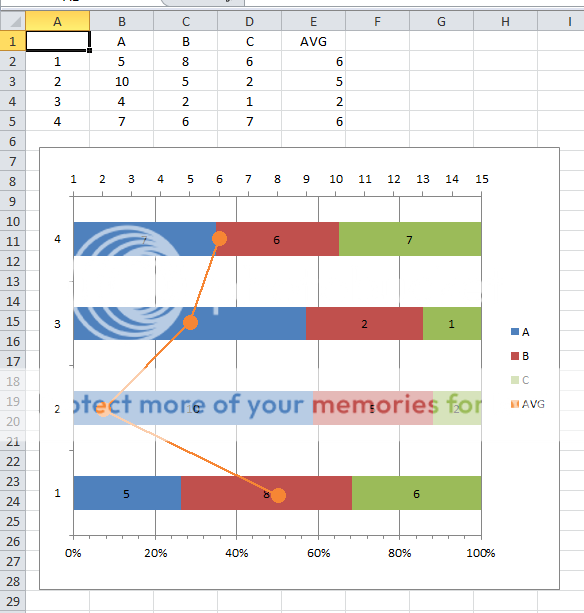
The main data is the columns A,B and C and then the there's the last column which is the average
and I want to make it look like a line chart (the one in the orange line). can anyone help me? thanks in advance
 

Excel Facts

Create a Pivot Table on a Map
If your data has zip codes, postal codes, or city names, select the data and use Insert, 3D Map. (Found to right of chart icons).
HI burndahows,

Can you post a sample data for columns A to D ? Thanks.


Regards,
DILIPandey
 
Upvote 0

Forum statistics

Threads
1,215,427
Messages
6,124,831
Members
449,190
Latest member
rscraig11

We've detected that you are using an adblocker.

We have a great community of people providing Excel help here, but the hosting costs are enormous. You can help keep this site running by allowing ads on MrExcel.com.
Allow Ads at MrExcel

Which adblocker are you using?

Disable AdBlock

Follow these easy steps to disable AdBlock

1)Click on the icon in the browser’s toolbar.
2)Click on the icon in the browser’s toolbar.
2)Click on the "Pause on this site" option.
Go back

Disable AdBlock Plus

Follow these easy steps to disable AdBlock Plus

1)Click on the icon in the browser’s toolbar.
2)Click on the toggle to disable it for "mrexcel.com".
Go back

Disable uBlock Origin

Follow these easy steps to disable uBlock Origin

1)Click on the icon in the browser’s toolbar.
2)Click on the "Power" button.
3)Click on the "Refresh" button.
Go back

Disable uBlock

Follow these easy steps to disable uBlock

1)Click on the icon in the browser’s toolbar.
2)Click on the "Power" button.
3)Click on the "Refresh" button.
Go back
Back
Top