Grasor
Board Regular
- Joined
- May 16, 2014
- Messages
- 123
- Office Version
- 365
- Platform
- Windows
Hello All,
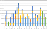
Been a stint since I was on the boards last but as usual we all find out way back here eventually. Today I was building a PivotTable with an accompanying PivotChart. The table is simple, it just groups Net Income by individual sources of income for each month by year. The PivotChart is a Stacked Bar Chart so all sources of income in a month are stacked on each other. The chart shows a column for each January first, then each February, etc. The problem is that it is difficult to clearly see where the "Januarys" end and the "Februarys" begin.
Attached is a snippet image of the chart.
How can I extend the lines on the horizontal axis to the top of the chart between each group of months?
Thanks as always.
G