Plot dots on a bar

Mandy_84

Board Regular
Joined
May 29, 2017
Messages
71
Hi there! Please help :)
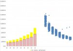
I have a graph with salary range and I want to plot my employees as dots on a bar per grades accordingly. I think I did all right, but my dots (employees) appear on a right side of the graph and not on the bars ( salary range). Both Employees and salary range are primary axis.
Thanks!
 
Last edited:

Excel Facts

Can you AutoAverage in Excel?
There is a drop-down next to the AutoSum symbol. Open the drop-down to choose AVERAGE, COUNT, MAX, or MIN
Hi, sorry, it's just not clear to me what exactly you mean.
Are you able to post a picture of your chart ?
 
Upvote 0
OK, well personally I would have preferred a screenshot in the post itself.
I don't want to follow your link, but others on this board may be happy to.
 
Upvote 0

Attachments

  • 3.JPG
    3.JPG
    20.2 KB · Views: 17
Upvote 0

Forum statistics

Threads
1,215,341
Messages
6,124,391
Members
449,155
Latest member
ravioli44

We've detected that you are using an adblocker.

We have a great community of people providing Excel help here, but the hosting costs are enormous. You can help keep this site running by allowing ads on MrExcel.com.
Allow Ads at MrExcel

Which adblocker are you using?

Disable AdBlock

Follow these easy steps to disable AdBlock

1)Click on the icon in the browser’s toolbar.
2)Click on the icon in the browser’s toolbar.
2)Click on the "Pause on this site" option.
Go back

Disable AdBlock Plus

Follow these easy steps to disable AdBlock Plus

1)Click on the icon in the browser’s toolbar.
2)Click on the toggle to disable it for "mrexcel.com".
Go back

Disable uBlock Origin

Follow these easy steps to disable uBlock Origin

1)Click on the icon in the browser’s toolbar.
2)Click on the "Power" button.
3)Click on the "Refresh" button.
Go back

Disable uBlock

Follow these easy steps to disable uBlock

1)Click on the icon in the browser’s toolbar.
2)Click on the "Power" button.
3)Click on the "Refresh" button.
Go back
Back
Top