[FONT="]Heey guys,
[/FONT]
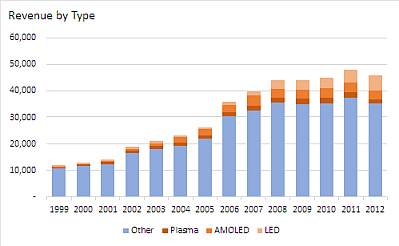
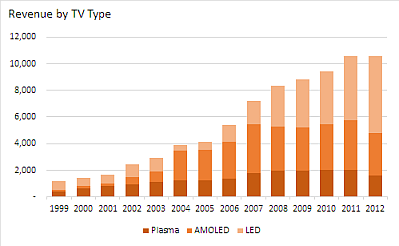
[FONT="]Does anyone have some experience on the problem below? I am having the following problems when trying to create a stacked chart. I would like to make adjustment in the chart below.
[/FONT]
[FONT="]Since I would like to make a similar chart with different data. For this example, assume the y-axis is different (e.g. % total revenue generated by selling televisions) and that the numbers in the chart stay the same.
I would like to adjust the chart in a way so that I can create a stacked chart, for example i would like to depict in the chart:
1999: 10 % of total revenue generated by selling televisions, of this 10%:
- 40 % plasma tv
- 30 % amoled tv
- 30 % led tv
2000: 11% of total revenue generated by selling televisions, of this 11%:
- 60 % plasma tv
- 20 % amoled tv
- 20 % led tv
[/FONT]
[/FONT]
[FONT="]Does anyone have some experience on the problem below? I am having the following problems when trying to create a stacked chart. I would like to make adjustment in the chart below.
[/FONT]
[FONT="]Since I would like to make a similar chart with different data. For this example, assume the y-axis is different (e.g. % total revenue generated by selling televisions) and that the numbers in the chart stay the same.
I would like to adjust the chart in a way so that I can create a stacked chart, for example i would like to depict in the chart:
1999: 10 % of total revenue generated by selling televisions, of this 10%:
- 40 % plasma tv
- 30 % amoled tv
- 30 % led tv
2000: 11% of total revenue generated by selling televisions, of this 11%:
- 60 % plasma tv
- 20 % amoled tv
- 20 % led tv
[/FONT]