
Add New Months To Excel Chart
October 23, 2001 - by Bill Jelen
This is an amazing Excel tip. A common problem faced by Excel users is they have a chart of time-series data and need to extend the chart with new figures. Editing all of the data series for a number of charts can be time consuming.
Somewhere around Excel 97, the wizards at Microsoft put in a seldom used feature. It is now possible to drag new data on to a chart and have the chart update automatically. This is a tip that needs very few words but has to be seen to be believed. I apologize for three graphics, but it is the best way to illustrate the tip.
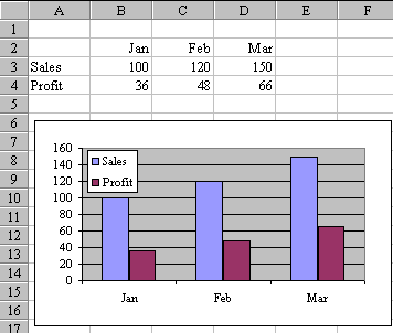
Say that you have set up this graph with three months of data:
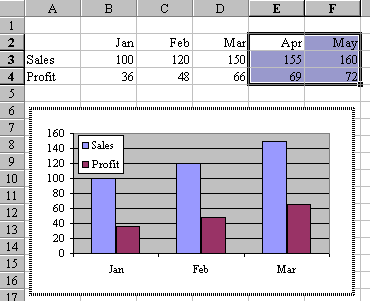
Then, two months pass and you now have new figures for April and May. Enter the data in Excel. Use the mouse to select the new cells, including the month headings. Click on the heavy black border around the selection and start to drag towards the chart. When you get over the chart, the border of the chart will look like this, and the arrow cursor will have a small plus sign to the right of it.
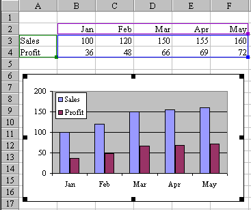
With the cursor over the graph, release the mouse button to drop the new data on to the chart. Presto! The chart expands and looks like this.
Wow! It seems so simple to watch, but for anyone who grew up with Lotus, you never would expect anything this simple.
Note
This trick does not seem to work if the Chart is on a separate sheet.
Here is an animated GIF showing the operation: