
Comparative Scatter Chart
July 27, 2017 - by Bill Jelen

X-Y Scatter Charts with 2 series are difficult to create
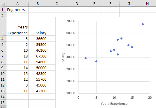
The chart below is an X-Y scatter chart. Each blue dot represents a salaried employee. The numbers along the bottom of the chart are years of experience. The vertical position of the dot indicates salary.
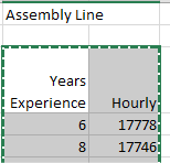
There is a second group of employees: assembly line workers. There are more workers in this category than in the first category. Select the data for the second group, including the headings. Copy with Ctrl+C.
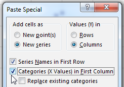
Click on the chart. In the Home tab, open the Paste Dropdown and choose Paste Special. In the Paste Special dialog, check the box Categories (X Values) in First Column. Click OK.
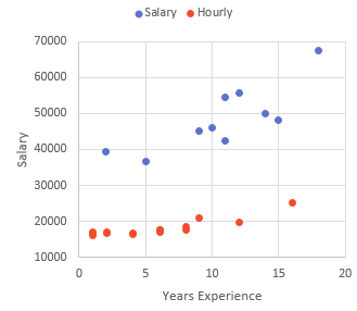
The result: You’ve added a new X-Y series to the chart. I changed the color of the second series and added a legend in this image.
Thanks to Access Analytic for the idea about pasting new data on a chart. Paul Seaman provided the Delete key tip.
Watch Video
- X-Y Scatter Charts with 2 series are difficult to create
- Create a one-series chart
- Select the new data, including the headings
- Click the chart
- Paste Special
- Choose X setting
- Add a legend to tell the series apart
Download File
Download the sample file here: Podcast1991.xlsx
Title Photo: LyraBelacqua Sally / pixabay