
Discover Insights About Your Excel Data
February 20, 2018 - by Bill Jelen

Insights is a new feature coming to Excel and Office 365. Office Insiders can take the new artificial-intelligence feature for a spin soon.
I remember working as a data analyst in Akron. After pulling data from the mainframe, creating a pivot table, formatting the page, I would always try to find a good sentence or two to use as a headline. I new that my manager's manager would spend 10 seconds with the report, and I wanted the headline to provide a sound-byte that he could take away from the report. An preview of an amazing new Artificial-Intelligence feature from Microsoft called Excel Insights is starting to roll out to Office Insiders. I've tried it, and I like it.
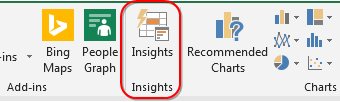
Insights will appear on your Insert tab, to the left of Charts.
Insights works with a table of data. Microsoft says it is better if you format with Ctrl + T, but I find it works with regular tabular data as well. Headings in row 1. No blank rows. No blank columns. No nested subdata within the data. No merged cells. Up to 250,000 cells for now. Choose one cell in the data and click Insights.
A new panel appears on the right with four charts. The first four charts are fairly generic. In fact, they look like the first four from the Excel 2013 Recommended Pivot Tables.
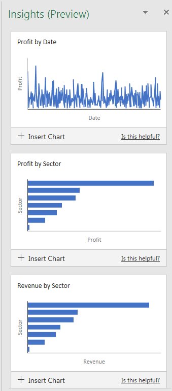
But there are 26 charts. Scroll down and you will start to see some detailed trends in the charts. Personally, I think they should have lead with these charts and saved the ho-hum charts for the end.
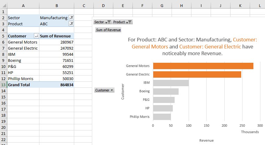
Now, the charts are too small to have labels. When you see one that you like, click Insert Chart. Excel will insert a new sheet, build a pivot table, build a pivot chart, and you can see all of the details.
And, the machine-learning service is going to get better. For each chart, you can indicate if the chart is helpful or not. Send feedback of which charts you like and which are ho-hum. Over time, and with responses from millions of people, the machine-learning algorithm will get smarter.
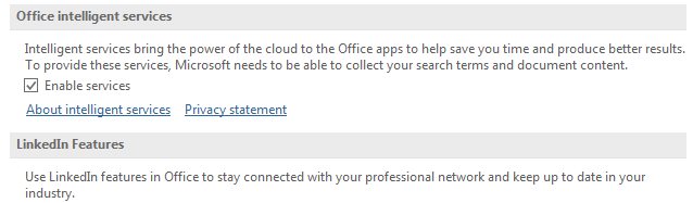
Of course, there are some privacy issues here. Read about what is going on by going to File, Options, General and reading the links under Office Intelligent Services. You have to decide if you are comfortable with what's happening. For me, I doubt that they really have the time to care how many bags of dog food I buy each month.
For now, Insights will be looking for Summary Analyses of Pivotable data, Rank, Evenness, Trend, Composite Signal, Attribution, Outstanding Top Two, Monotonicity (always increasing or always decreasing), Unimodality (having a single peak data point) and Chart Recommendations for smaller data sets.
I suppose I wish that I would have had this back in 1989 when I was trying to find something interesting to say as the headline for each report.
I've demoed some of the features of Insights in this video:
Video Transcript
Learn Excel from MrExcel Podcast, Episode 2185: A First Look at Insights for Excel.
Hey, just a quick program note: February 14th through March 31st, I'm running 40 days of brand new Excel articles. All of those will be at MrExcel.com, in the Excel tips folder. Most won't have a video. This is day number 6 out of 40, and the first video that we've come to. So check it out at the website. Excel 2019 is coming; I need to write a lot of books, I need to get back in the habit of writing.
Alright, so, this is a first look at an awesome, new feature that just lit up in my copy of Office 365. And, now, I'm an office insider, so I have this before most people. Even if you're an office insider, if you're not associated with the organization, you don't have it yet. But it's coming, and it'll definitely be there for Excel 2019, which comes out in the second half of this year. Alright?
So we have some data sets here. This is a data set that I did not create; I have no idea what's in this data set, I've never looked at this data set before. 4500 rows. So I'm going to select the data, I'm going to come here to Insights-- and this is a preview of Insight so, you know, be careful, when this actually comes out to general availability it's going to look different, probably, than we have now. But it's cool. Alright. So, Excel, using some sort of artificial intelligence, has looked at my data and found some interesting things. Like, here's the "Spend by Fiscal Month", "Spend by Category", Spend decreases over time for marketing and category people, Payroll has a noticeably higher spending-- well, that's normal. Alright, so that's, you know, probably not that exciting, that probably matches most things. And then you see that there's a total of 26 results here, alright? So you can scroll through these and see if anything looks interesting. You can provide feedback to them: Is this helpful? Yes, No? Like the payroll one, that's kind of obvious to me; so is this helpful? No. And I suppose that will help them with their algorithms in the future.
Alright, now, let's take a look at what happens here if we find something interesting. So just go off to the right hand side. You know, these charts are really thumbnails, right? You can't see that months or anything like that. So let's say Insert Chart. Alright. Look at that, they actually created a little pivot chart for me and added it to the data set. Wow, that is pretty cool. Could I have created this chart? Absolutely, I could have created this chart, but, you know, if it's not my data and I don't know what to expect, this is a great, great feature.
Now, that was 4,500 rows; here's 13 rows-- 12 rows and a header, Visitors and Goal. Let's see what Insights comes up with for this data set. Alright. So they show me Goal and Visitors by month-- Visitors by month-- you know, these are some basic charts but, you know, if you don't know where to start, this is beautiful.
Alright, now, these two examples, these are Microsoft demo data sets, right? And, of course, you know, my my first take is to take my data-- the data that I use all the time in my live Power Excel seminars-- and throw that at Insights. And a troubleshooting thing, or a thing that I didn't even notice until I asked the team of Microsoft, it's like, "Well, hey, why isn't it working with my data?" And they wrote back and they said, "Hey, why is Sector classified as a date, and why is Customer classified as a date?" I'm like. "What?" I didn't know this and I guess when I created this, put the dates in first then I inserted a column, inserted a column, and added Sector and Customer and so they got classified as dates. I didn't realize there were dates-- they've been misclassified for 10 years-- I'm guessing when I created this. So, I'm going to select that whole data set and change it back to general. Alright? If you say it's a date, and it has text, that's going to confuse Insights.
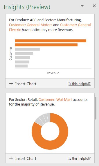
Alright? So here's the data: 563 rows, covers 2 years worth of dates. I know this data pretty well-- it's fake data, and that'll be interesting to see if they can find any insights in fake data. So, I'll choose Insights Alright, showing Profit by Date; Profit by Sector; Revenue by Sector, yeah, yeah; let's Show All; Quantity by Region and Product; here's a date that has the largest revenue for a particular Sector; for a retail Customer, Walmart accounts for the majority of quantity-- that's absolutely correct, I know that Walmart is the largest customer in this data. Alright? So, boy, that one's useful right there. Is that helpful? Yes, yes it is. It's very nice. For Product: ABC and Sector: Manufacturing, Customer: General Motors and General Electric have noticeably more revenue. This is cool stuff. This is stuff-- because I used this data set every day in my live Excel seminars, and hundreds of times in the podcast, I know these things to be true, right? I know this data, and this artificial intelligence is coming up with these trends. It's cool. I can't wait for the final version to come out.
Alright, now, normally this is the point where I tell you that what we're talking about is in this book, but it's not in this book because it just came out this week. But a lot of other great things in this book, Power Excel with MrExcel. Click that "I" in the top right-hand corner to take a look at more information.
Alright, so Insights: New artificial Intelligence feature coming in Excel 2019 and to Office 365; slowly rolling out now in preview; select your data, go to Insights-- alright, the Insert tab and choose Insights; they analyze your data in an attempt to find trends or interesting things in your data; and if you agree it's interesting, you can add a chart that actually creates a pivot table for you. Really, really cool. Be sure to pay attention to data types, even if you don't realize that data types are there. And, of course, by the time this hits generally-- so I'm recording this February of 2018-- by the time it gets to you, it might look different.
Well, hey, I want to thank you for stopping by, I'll see you next time for another netcast from MrExcel.
Tuesday's articles are getting ready for the new features in Excel 2019.
Excel Thought Of the Day
I've asked my Excel Master friends for their advice about Excel. Today's thought to ponder:
"To become Great you must Excel"
Title Photo: Jacob Owens / unsplash