
Excel 2024: Build Dashboards with Sparklines and Slicers
May 24, 2024 - by Bill Jelen

New tools debuted in Excel 2010 that let you create interactive dashboards that do not look like Excel. This figure shows an Excel workbook with two slicers, Region and Line, used to filter the data. Also in this figure, pivot charts plus a collection of sparkline charts illustrate sales trends.
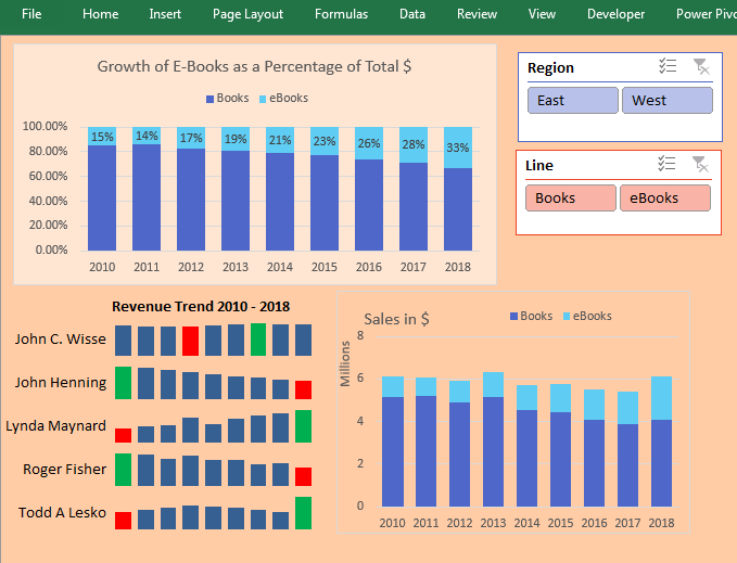
You can use a setup like this and give your manager's manager a touch screen. All you have to do is teach people how to use the slicers, and they will be able to use this interactive tool for running reports. Touch the East region and the Books line. All of the charts update to reflect sales of books in the East region.

Switch to eBooks, and the data updates.

Pivot Tables Galore
Arrange your charts so they fit the size of your display monitor. Each pivot chart has an associated pivot table that does not need to be seen. Those pivot tables can be moved to another sheet or to columns outside of the area seen on the display.
Note
This technique requires all pivot tables share a pivot table cache. I have a video showing how to use VBA to synchronize slicers from two data sets at http://mrx.cl/syncslicer.

Filter Multiple Pivot Tables with Slicers
Slicers provide a visual way to filter. Choose the first pivot table on your dashboard and select Analyze, Slicers. Add slicers for region and line. Use the Slicer Tools tab in the Ribbon to change the color and the number of columns in each slicer. Resize the slicers to fit and then arrange them on your dashboard.
Initially, the slicers are tied to only the first pivot table. Select a cell in the second pivot table and choose Filter Connections. Indicate which slicers should be tied to this pivot table. In many cases, you will tie each pivot table to all slicers. But not always. For example, in the chart showing how Books and eBooks add up to 100%, you need to keep all lines. The Filter Connections dialog box choices for that pivot table connect to the Region slicer but not the Line slicer.

Thanks to John Michaloudis from MyExcelOnline.com for the connecting multiple pivot tables to one slicer idea.
This article is an excerpt from MrExcel 2024 Igniting Excel
Title photo by Volodymyr Hryshchenko on Unsplash