Excel 2024: Create Waterfall Charts


March 25, 2024 - by

Excel 2024: Create Waterfall Charts

For 12 years, I worked at a company doing data analysis. One of my regular tasks was to analyze the profit on sales proposals before they went out the door. I did this with a waterfall chart. For me, the waterfall chart never would have to dip below the zero axis. I used a few tricks to make the columns float and drew the connector lines in by hand, using a ruler and a black pen.

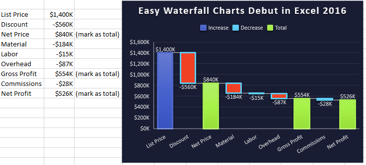
Excel 2016 introduced a built-in Waterfall chart type. Select your range of data and create the chart. In the chart below, three columns are marked as total: Net Price, Gross Profit, and Net Profit. Excel won't automatically know which columns should be totals. Click any column to select all columns in the chart. Then single-click one total column. Right-click and select as Total. Repeat for the other columns that should touch the X-axis.


A pricing waterfall chart starts out with a tall List Price column on the left, then a floating column for Discount gets you to Net Price. Then floating columns for expenses like Material, Labor, and Overhead. Finally, on the right, you get to net profit. This type of chart illustrates how a change in discount leads to smaller profit.

A pricing waterfall chart starts out with a tall List Price column on the left, then a floating column for Discount gets you to Net Price. Then floating columns for expenses like Material, Labor, and Overhead. Finally, on the right, you get to net profit. This type of chart illustrates how a change in discount leads to smaller profit.

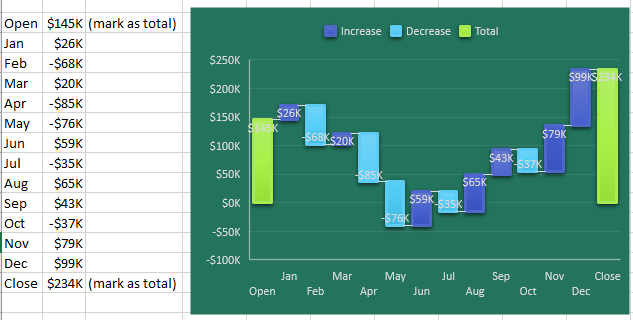
The waterfall charts even work for cash flow charts that might go below zero.

Another version of a waterfall chart is to show Cash Flow. The Cash Flow balance for December 31 is on the left. Each month, there is a forecast of positive cash flow or negative cash flow. In this particular chart, some months have the cash balance go negative (buying lots of material for a project that won't be invoiced for 90 days). While there were tricks in the past to create waterfall charts, this particular example where one or more months go negative were particularly tricky in the past and are easy now.

Tip

To change the color for Increase/Decrease or Total: Click on the legend and then click on one item in the legend. Press Ctrl+1 to open the Format panel for that series and choose a new Fill Color.


This article is an excerpt from MrExcel 2024 Igniting Excel

Title photo by Joshua Sortino on Unsplash