Excel 2024: Use a Pivot Table to Compare Lists


May 22, 2024 - by

Excel 2024: Use a Pivot Table to Compare Lists

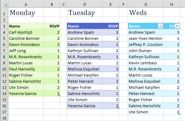
When you think of comparing lists, you probably think of VLOOKUP. If you have two lists to compare, you need to add two columns of VLOOKUP. In the figure below, you are trying to compare Tuesday to Monday and Wednesday to Tuesday and maybe even Wednesday to Monday. It is going to take a lot of VLOOKUP columns to figure out who was added to and dropped from each list.

Three lists are shown in Excel. Each list has a name and a number. There are lists from Monday, Tuesday, and Wednesday.

You can use pivot tables to make this job far easier. Combine all of your lists into a single list with a new column called Source. In the Source column, identify which list the data came from. Build a pivot table from the combined list, with Name in rows, RSVP in values, and Source in columns. Turn off the Grand Total row, and you have a neat list showing a superset from day to day, as shown below.


Combine the three lists into one super list. There is a third column, called Source. The Source column indicates if this record came from Monday, Tuesday, or Wednesday list.

A pivot table with Name along the left column and source across the top. It is easy to see for each name if they were blank on Monday, appeared on Tuesday, or the number changed on Wednesday.

Bonus Tip: Show Up/Down Markers

There is a super-obscure way to add up/down markers to a pivot table to indicate an increase or a decrease.

Somewhere outside the pivot table, add columns to show increases or decreases. In the figure below, the difference between I6 and H6 is 3, but you just want to record this as a positive change. Use =SIGN(I6-H6) to get either +1, 0, or -1.

The pivot table has Monday in H, Tuesday in I, Wednesday in J. Off the the right, two new columns are calculating the change from the previous day. The Tuesday change is =SIGN(I6 - H6). This gets you either a negative 1, zero, or one.


Select the two-column range showing the sign of the change and then select Home, Conditional Formatting, Icon Sets, 3 Triangles. (I have no idea why Microsoft called this option 3 Triangles, when it is clearly 2 Triangles and a Dash, as shown below.)

Now that you've generated some values of -1, zero, and one, select those helper cells and apply, Home, Conditional Formatting, Icon Sets, 3 Triangles. Note that the name called "3 Triangles" is a lie - the icon set has a green up icon, a yellow "no change" icon, and a red "down" icon. Technically, it should be called two triangles and a rectangle.

With the same range selected, now select Home, Conditional Formatting, Manage Rules, Edit Rule. Check the Show Icon Only checkbox.

Manage the rules, and check the box for Show Icon Only. This prevents the 1, 0, -1 from appearing in the cells.

With the same range selected, press Ctrl+C to copy. Select the first Tuesday cell in the pivot table. From the Home tab, open the Paste dropdown and choose Linked Picture. Excel pastes a live picture of the icons above the table.

Copy the range of icons. Select the first Tuesday cell in the pivot table. On the Home tab, open the Paste Dropdown. The very last icon is called Linked Picture (I). Select this.

At this point, adjust the column widths of the extra two columns showing the icons so that the icons line up next to the numbers in your pivot table, as shown below.

Now, you have overlaid pictures of the Up/Flat/Down icon next to the numbers in the pivot table.

After seeing this result, I don't really like the thick yellow dash to indicate no change. If you don't like it either, select Home, Conditional Formatting, Manage Rules, Edit. Open the dropdown for the thick yellow dash and choose No Cell Icon, and you get the result shown below.

Up and down indicators still remain, but the yellow rectangles indicating "no change" are gone.

Bonus Tip: Compare Two Lists by Using Go To Special

This tip is not as robust as using a Pivot Table to Compare Two Lists, but it comes in handy when you have to compare one column to another column.

In the figure below, say that you want to find any changes between column A and column D.

There are lists of products in A and D.  Select A2:A9. Ctrl+Select D2:D9. Open Home, Find & Select, Go To Special. Choose Row Differences. OK.

Select the data in A2:A9 and then hold down the Ctrl key while you select the data in D2:D9.

Select, Home, Find & Select, Go To Special. Then, in the Go To Special dialog, choose Row Differences. Click OK.

Only the items in column A that do not match the items in column D are selected. Use a red font to mark these items, as shown below.

After choosing Row Differences, any items in column A that do not match column D are highlighted. Apply a red font so you can identify which have changed.

Caution: This technique works only for lists that are mostly identical. If you insert one new row near the top of the second list, causing all future rows to be offset by one row, each of those rows is marked as a row difference.

Thanks to Colleen Young for this tip.


This article is an excerpt from MrExcel 2024 Igniting Excel

Title photo by Getty Images on Unsplash