
New Ribbon and Help Screen
August 28, 2018 - by Bill Jelen

In a was against their customers stuck on buying perpetual licenses of Excel 2016 or Excel 2019, Microsoft introduced a new Ribbon shortly *after* finishing Excel 2019. You read that correctly - if you fork over $399 to buy Excel 2019 when it is released later this fall, you will be stuck with the older-looking interface. Customers with Office 365 will have the new interface.
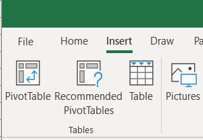
The icons in the new Ribbon seem to lose definition. Take a look at the Bent arrow in the Pivot Table icon and the black sun in the Illustrations icon. This is in the new Fall 2018 version of the Ribbon for Office 365 customers.
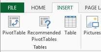
Contrast this with the Excel 2016/2019 ribbon and former Office 365 ribbon. In those versions, the pivot table arrow is curved. The Values area of the recommended pivot table has data, the Table has headings instead of triangles, mountains are filled in and the Sun is yellow.
Another difference is how Office shows the selected tab. Previously, the selected Ribbon tab was a different color, making it look like a Pendaflex folder tab. Now, the line is thicker and moved to the bottom of the tab.
I've been using the new ribbon for a few weeks and I can say that I neither hate it nor love it.
The new change seems reminiscent of when Excel 2010 transitioned to Excel 2013. They used ribbon tabs in ALL CAPS and everything became very white.
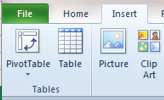
Contrast with Excel 2010 ribbon that seems very high definition compared to the newer icons.
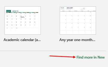
New "Home" Category in the File Menu
When you see the start screen or open the File menu, there is a new category in the top left called Home. The three top choices are now Home, New, and Open.
The Home category is a combination of some parts of New and some parts of Open. At the top is the "New" icon, plus some tutorials and templates. Below the line, you can choose from Recent Files, but not Recent Folders.
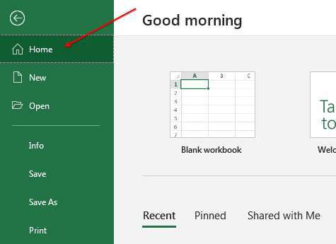
At the far right, just below the templates is a hyperlink to "Find More In New". At the bottom far right is "Find More in Open". These are both equivalent to clicking the words New or Open on the left side of the screen.
Watch Video
Video Transcript
Learn Excel from MrExcel Podcast, Episodes 2238: New Ribbon and New Home Screen.
If you like what you see in this video, please subscribe and ring that bell.
Hey, welcome back to the MrExcel netcast, I'm Bill Jelen. Two things have changed here in the summer of 2018. First off, when you open Excel or go to the File menu, we get this new thing called the Home Screen. It's early now, it's before 6 A.M. so it's wishing me a good morning. I'm sure that changes, you know. I wish if you were here like at 1:30 in the morning it’d say, like, What the heck are you doing awake at this time? But good morning. And then Home-- and what Home seems to be, is it seems to be a weird combination of both New and Open. So, here at the top above the line, is what I call New-- so, Blank Workbook, and then some of the templates that they have. And if you wanted to get to all of the templates you can either click New or go to More Templates. And I'll take you to the New screen, and then below that, some sort of weird version of the Open screen that shows you the recent files-- the pin files shared with me, but not, you know, recent folders. And if you would scroll all the way down beneath these, then you get two more workbooks, which is essentially the open screen so, you know, that's the old New screen with lots of templates. That's the old Open screen with a chance to get the folders and choose places. Home just seems to be a weird combination of those. And again, it's going to open to here when you open Excel. It's going to open to here when you go to the file menu. Alright? So that's one new thing.
The other thing that's new-- let me just create a new workbook here so it's less, it's less jarring-- is they have redrawn the icons and, I have to tell you, I've seen these for a while. I can't say that I hate them and I can't say that I love them. It frankly looks like we're de-evolving-- we're regressing backwards, you know. So just to see a combination here-- here's the Insert tab in Excel-- From the new icons to what we had in Excel 2016, right? And, like, let's just take a look at this Pictures icon here-- the mountain used to be filled in in blue and now it's just an outline, the Sun used to be yellow and now our Sun just turned black. It just looks like some definition has been lost. And it really seems like it's we're going in that direction. If we go back to Office 2013 or even back to Office 2010, in office 2010 it looked like a little Polaroid photo, two mountains, a Sun, the Sun had an outline; SmartArt here had a glow, and then we lose the glow and it's just getting less. Although, I guess... you know, we used to have a 3D Pie chart and now it's just a flat Pie chart.
So, hey, let me know what you think down in the YouTube comments. What do you think of these new icons? Do you like the old icons or the new icons or you just don't care? And if you like the old icons, give me some words to describe what they did here. What happened? How did we lose definition? Like, even, you know, the table doesn't look as much like a table, and the recommended pivot tables used to have data in the values area and now its blank.
Another big change here is, it used to be that when you selected various tabs in the ribbon the tab changed colors and you had a line out of three sides, and that when we change tabs in the ribbon, it's just the line at the bottom of the tab. I mean, you can barely, barely make out there that it's a different color, but it's, you know, like gray and just a tiny bit lighter gray, but I preferred when it actually looked like a tab. You know, I noticed that this new tab designator here, the underline has been around for a while. If you have a data model pivot table, the Active and All, I've been using that even longer than the ribbon has, so, you know, they had this in the works, I guess, when they planned it.
Leave a note out in the YouTube comments, let me know what you think about this. Between us, if you buy Excel 2019, you're going to get the old version. The big news today is the new Home category of the File menu, or when you open Excel. Well, hey, all of this is of course in my new book, "Microsoft Excel 2019 Inside Out." Today, a new Home screen and the File menu, accommodation of New and Open, and then the new ribbon illustrations-- just, really either hate them or love them. Download the workbook from today's video so you can compare those, visit the URL in the YouTube description.
I want to thank you for stopping by, I'll see you next time for another netcast from MrExcel.
Download Excel File
To download the excel file: new-ribbon-and-help-screen.xlsx
Let me know what you think of the new Ribobn by posting a comment in the YouTube comments.
Excel Thought Of the Day
I've asked my Excel Master friends for their advice about Excel. Today's thought to ponder:
"Don’t Panic! Pivot!"
Title Photo: Jesse Roberts on Unsplash