
Speedometer Chart Creator Add-In for Excel
January 2009

This program is designed to automatically create dial charts grouped in dashboards. Each dashboard is created in its own sheet and can contain one or more dials. Each chart represents a certain parameter depicted as a dial reading – a single value for each dial.
- Publisher: Holy Macro! Books
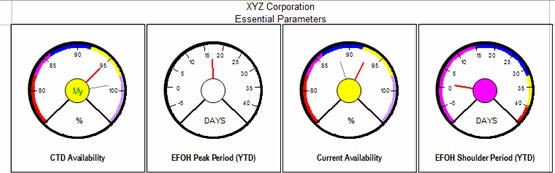
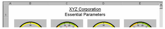
A typical dashboard might look like this:
You use the add-in on one computer to create the dashboards. You can then share the charts with others who don’t need the add-in to view the speedometer charts. Try it out – download a workbook created with the add-in.
Note
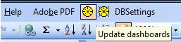
The add-in is compatible with PC versions of Excel 97 through Excel 2003. The add-in will not work reliably with Excel 2007 and is not compatible with Mac versions of Excel. In Excel 2003 and earlier, you will have three new icons on the menu bar:
Understanding Speedometer Charts
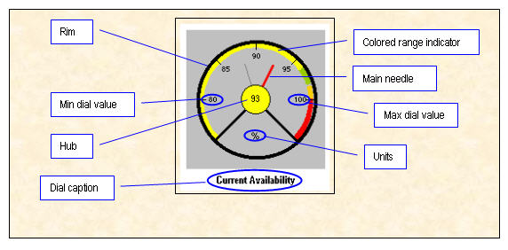
A speedometer chart is a new chart type not available in Excel. To generate the dials, the program uses a customized XY chart with two autoshapes (circles to represent the outer periphery and dial hub) – the rest of the chart is made up of several series which derive data from user input as follows:
- Start value, Stop value, Step Value for the dial
- Dial reading (which is depicted using the red pointer)
- The start and stop values for the various colored zones that you see
- The units label – e.g. (“%”, “DAYS”)
- The dial title – e.g. (“CTD Availability”)
The various dials you see on a dashboard are pictures of such a chart – the dials are generated when you click a button (captioned ‘Update’) which reads data for the various parameters from an Excel table (one row of data for each dial), updates the XY chart in the background and pastes a (static) picture of this in the dashboard worksheet.
Note that you cannot edit a dial as you would a normal chart but you can always generate a new set of dashboards at any time - it just takes a few seconds. You are free to copy/paste individual dials or entire dashboards anywhere you wish to – for example a Powerpoint slide.
How to Use the Utility
The add-in installs 3 icons:
- Click the yellow dial icon and a new worksheet called ChtData will be inserted in the active workbook. You will fill out the values on this worksheet (or use formulas to point to other sheets in your workbook).
- Click the yellow dial icon again and new worksheets containing speedometer charts will be created.
- The second yellow dial icon with an X through the icon is used to remove dashboards from the current workbook.
- The DBSettings icon allows you to control global settings for the speedometer charts.
The ChtData sheet contains all of the relevant data for generating the charts. Before describing the data on ChtData, let's take a look at the anatomy of a dial chart.
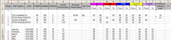
Here’s a bird’s eye view screenshot of the data layout. The various fields are in columns A through V. The source data for the sample dial shown above is in row 5. We will look at it again at a more legible zoom setting below.
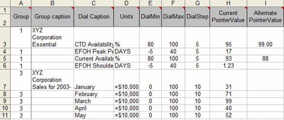
A - Group Number - Used to Create Multiple Worksheets
This feature is new. Clients wanted the ability to create 9 charts on one worksheet and another 4 charts on a second worksheet. In the image above, the first four charts will be created on Dashboard1 and the next charts will be created on Dashboard3.
B - Group Caption - Title at Top of Dashboard Worksheet
This is the header text for the Dashboard worksheet. You need to enter this only for any one of the dials belonging to a group – putting it in the first dial of a group is the most logical place to enter this. In case you wish the text to appear in two lines, you would type Alt+Enter (when entering data in the cell) at the point in the text where you wish to insert the line feed. The code automatically underlines the text up to the line feed. For example, XYZ Corporation is underlined for Dashboard1.
C - Dial Caption - Caption underneath the Speedometer
This is the caption appearing at the bottom of the dial. While specifying the text take care to keep it short enough to fit inside the width available, else some of it may wrap out of sight.
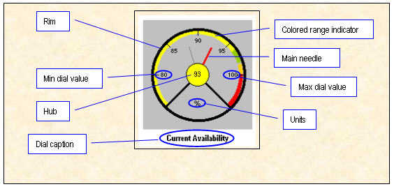
D - Units Caption - Appears in bottom of Speedometer
This is the text that appears below the hub. It expresses the units for the dial. The sample data illustrates use of three different units: %, DAYS and ×10,000. Since Version 2.1, this area can be blank.
E:G - Dial Min, Max, and Step
As the names imply these cells contain the start, stop and step values for a dial. You can specify a different set of values for each dial. Notice the buffer zones on the scale before DialMin and after DialMax. This has been done on aesthetic considerations so that the pointer is visible even when the dial reading is at min or max value. We will refer to the entire scale including these buffer zones as the physical scale.
Caution
When specifying the Step value, you should verify that it is such that no more than 25 markers are generated the between the Start value and the Stop value.
H - Current Pointer Value
This is the dial reading – the value of the parameter for which the dial is drawn. The main needle (red) points to this value on the dial. For our sample dial this value is 93. You can opt to display this reading inside the hub or alternate text.
I - Alternate Pointer value
This is an optional dial value which can be used to show, say last month’s or last year’s or some previous/comparative value of the same parameter. If a value is specified in this column, the alternate needle (faint grey) points to this value on the dial. If this cell is left blank, no alternate needle is drawn.
J - Alternative Hub Text
In the options box, if you've chosen to display the value in the hub, this column will be ignored and the pointer value from H will be displayed in the hub. If you leave the hub checkbox unchecked, then the program will pull hub text from this column. If you want to mix - have some hubs show value and other hubs show text, then you can leave the box unchecked, fill in values for some cells in column J and then formulas for the other values in column J that point to the suitable value in H.
K:T - Color Zones
Version 1 of the dashboard chart offered three zones - red, yellow, green - based on the traffic signal colors in the United States. Recognizing that the speedometer dial charts are being used around the world, we've enhanced the application to allow up to 5 color zones and to allow customization of the colors used. To change a color, simply use a different fill color in cell K1
All dials generated in a given session will have the same color scheme, but may have different start/stop parameters for each color.
To set up the color zones, enter numbers in adjacent cells to specify the zone start and zone end value in terms of the scale for a particular dial. The color of the zone is decided by the color with which you fill the cells in row 1 of the column. You use can have up to 5 zones on a dial. If you leave both cells for a zone blank, a zone of that color is not created for that particular dial. If you leave the ‘From’ cell blank, the zone starts from the beginning of the scale rather than DialMin. If you leave the ‘To’ cell blank, the zone extends to the physical end of the scale rather than DialMax.
To understand this let us examine the data in row 5 for our sample dial:
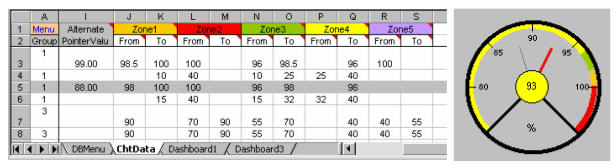
First, note that the sequence of zones is decided by the values in the cells rather than the sequence in Row 1 of the worksheet. This allows us to use Yellow, Green, Orange Red for this dial instead of the default order of Orange, Red, Green, Yellow, Purple.
- Zone4 (Yellow) – [Blank] to 96 – Scale-wise, this is the first zone for the dial. The From value is blank so the zone begins from the physical beginning of the scale rather than DialMin(80). If we wish it to start at DialMin we would put the value 80 in the ‘From’ column.
- Zone5 (Green) – 96 to 98 - Scale-wise, this is the second zone for the dial.
- Zone1 (Gold) – 98 to 100 - Scale-wise, this is the third zone for the dial.
- Zone2 (Red) – 100 to [Blank]– Scale-wise, this is the fourth zone for the dial. The ‘To’ value is blank so the zone ends at the physical end of the scale rather than DialMax.
You now have a basic understanding of the parameters required to create a dial chart. In theory, you would set up the colors and ranges once, and then update the Current Pointer value in H each time you need to update the chart.
Using the DBSettings
The DBSettings icon displays a dialog where you can adjust several global variables.
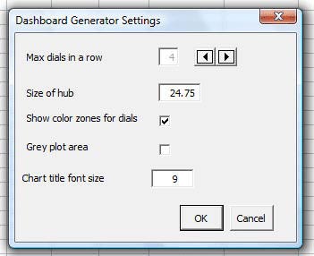
- Max Dials in a Row – if you specify that 9 speedometer charts should appear on one dashboard, use a setting of 3 dials per row to force a 3x3 arrangement of dials.
- Size of Hub – the suggested setting is 24.75. You can scale up or down as necessary. Settings close to 25 should generate good results. As you enlarge the chart, the fit between the various elements may suffer.
- Show Color Zones for Dials – if you uncheck this, the dial will not show any color zones around the periphery
- Grey Plot Area – The standard speedometer chart in versions 1 & 2 had a grey background. A customer suggested a white background, which has become the default in Version 3. To return to a grey background, use this checkbox.
- Chart Title Font Size – the default value of 9 works for most charts. You can adjust up or down to suit your needs.
Generating the Chart Using the Speedometer Icon

This buttons triggers the Dashboard Generator program. The program reads the parameters for each dial from the database on ChtData, generates the dial and places it sequentially on the Dashboard sheeta for the dashboard group to which the dial belongs. If required, it adds a dashboard sheet for a particular group and names it Dashboardn where ‘n’ is the dashboard (group) number before generating the dials for a group. Remember that you need to run Update every time you edit the data on ChtDat to see the changes. When you click Update - it'll Update ALL charts for ALL dashboards - inserting new sheets named Dashboard1, Dashboard2 etc. (at the end of the workbook) if one doesn't already exist. The number of such sheets will be equal to the number of groups defined on sheet ChtData.
Use the Clear icon

This button simply clears all the dials from the Dashboard sheets in the workbook. It is meant to reduce the file size to make it portable - in case you wish to email a file with many dashboards. You can always re-run Update to populate the dashboards when the copied file has reached its destination.
Once the dashboards have been generated, you can copy/paste the individual dials or copy a picture of entire dashboard ranges to the presentation you are working on.
Miscellaneous Notes
Resizing the dials:
If you enlarge the pictures, the colored zone series may get detached from the dial periphery. Also the lines may appear distorted. This is because of the way the chart is designed - for the size of the chart as it is now, everything will appear correct, the zones will be just within the inner border of the dial. Resizing will distort things (especially when you are using color zones). If you do not wish to use color zones you simply leave the From To values for color zones (Range J through S) blank - then you can resize the pictures with some freedom.
Page Setup
The program will respect any page setup changes that you make. If you create a sheet of charts today, set certain page setup settings, then create the chart again tomorrow, the program will remember the page setup settings that you assigned.
Page Setup
It is very likely that the data for the dashboards you generate would be located in workbooks. If so, you wouldn’t want to enter fresh data for every session. A convenient way to use this program is to save the Dashboard Generator workbook with different names that you can easily identify with the data source on which it depends and in each such copy, put formulas referring to cells/ranges in the related data source workbook(s). Using formulas gives you the advantage that the when you open a formula-based Dashboard Generator workbook, the formulas update (when you update links) even if the the source book is not open – you just need to click Update.
Carrying this concept a little further – let’s say you have a series of monthly workbooks with identical structure. You have a formula-based Dashboard Generator which you last ran on the file for April. Now you wish to run it for May. All you need to do is to open the related Dashboard Generator, do Edit>Links>Change Source and point to the file for May. The formulas will now draw data from the file for May and you just need to click the Update button to update the dashboards.
The Speedometer Chart Utility is the Fastest Method
One client reported attempting to produce speedometer charts using Autoshapes. They would spend the better part of a day each month to produce these reports for their manager. After buying the Speedometer chart utility, they can produce dozens of speedometer charts each day in a matter of seconds. Their speedometer-crazy manager is thrilled with the dashboard which are displayed on the production floor each day.
Requirements
This add-in requires that you have a copy of Excel 97, Excel 2000, Excel 2002, or Excel 2003. It is not compatible with Excel 2007 or any Macintosh versions of Excel.