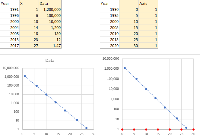
Scatter Chart - Exponential Trend-line Question

huntk20

New Member
Joined
Dec 13, 2017
Messages
2
Hello all,

I have used this forum as an Excel resource for years but I am having one of my first major issues with the Excel Scatter Chart trying to plot an exponential trend-line with one of my data sets. See below:

14k9uvc.png


Basically, the exponential trend line will not plot on the second chart, it shows up in the objects available in the Chart but it is invisible or just not working. The Y-Axis on both charts is using a Logarithmic scale of 10. Is the second chart hitting some kind of arithmetic overflow because of the wide range used?

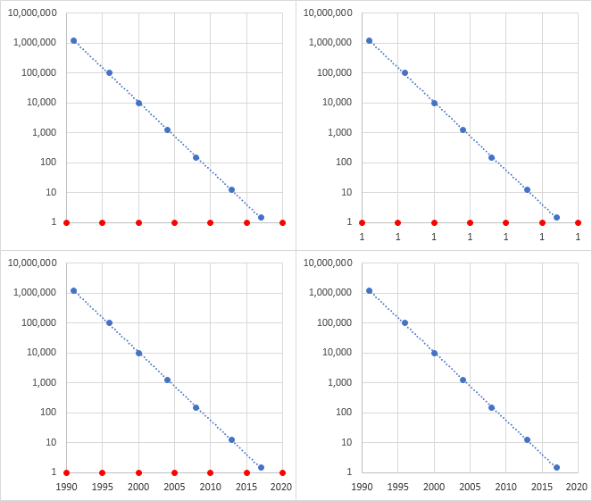
I've also attempted manually calculating the exponential lines coordinates but only as far as the screenshot below:
seoyrr.png


Also note, I need to use years as the X-Axis, years are very crucial to this data set. It is very similar to charts that have demonstrated Moore's Law (you can Google Moore's Law Exponential Charts). Any advice or help on this issue would be greatly appreciated because myself and many others are stumped.
 

Excel Facts

Enter current date or time
Ctrl+: enters current time. Ctrl+; enters current date. Use Ctrl+: Ctrl+; Enter for current date & time.
I got an invisible trendline as well (I only used your first and last data points). When I had the trendline equation shown on the chart, the pre-exponential factor was 2E+308, which is a pretty large number. When I changed the number format of the formula (usually I'll try Scientific with lots of digits for precision), the equation became meaningless.

When I replaced the X values with numbers like 1 to 27 (i.e., year minus 1990), the trendline appeared and the formula became usable.

Why are the actual years crucial? You can always use something like (year-1990) in any calculations, and axis labels are easy enough to fake in a chart.
 
Upvote 0
I also realized the pre-exponential factor is an extremely large number. I have also noticed the correct behavior using a lower number scale starting at 1 but in the eyes of others it is incorrect. Really sorry for not mentioning those test cases in the original post and saving you time.

So we have attempted faking the the X-Axis with text boxes but the issue remains, the data is ever changing and some people just want to enter it and the chart plots correctly in front of a small live group.

You can always use something like (year-1990) in any calculations, and axis labels are easy enough to fake in a chart.

Can you explain a little more? Can we somehow map 1-30 behind the a visual label of years 1990-2020?
 
Upvote 0
The table below left has the data for the exponential relationship. Year is in the first column, X in the second column is year minus 1990. I've filled it out a bit. The first chart was generated with the shaded cells in the table. The left chart is just these points and the trendline. I have formatted the X axis so its min is 0 and max is 30.

The table on the right is the data for the fake axis labels. Year, X (year-1990), and the third column is the minimum of the Y axis, or 1. I selected the shaded range of this table, selected the chart, and used Paste Special to add the data as a new series, by columns, category labels (X values) in the first column, series name in first row. These are the red circles in the second chart.

4iDQxRh.png


In the first chart below, I hid the built-in X axis labels by using a custom number format of "" (yes, that's two double quotes). This maintains the spacing for labels below the chart.

In the second chart below, I added data labels below the points. The default Y values (1) are shown.

In the third chart below, I've used the Values from Cells option for the data labels, and I selected the years from the second table above.

In the fourth chart, I finished my special effects by formatting the added series to use no markers instead of the red circles.

N6dULui.png
 
Upvote 0

Forum statistics

Threads
1,214,996
Messages
6,122,636
Members
449,092
Latest member
bsb1122

We've detected that you are using an adblocker.

We have a great community of people providing Excel help here, but the hosting costs are enormous. You can help keep this site running by allowing ads on MrExcel.com.
Allow Ads at MrExcel

Which adblocker are you using?

Disable AdBlock

Follow these easy steps to disable AdBlock

1)Click on the icon in the browser’s toolbar.
2)Click on the icon in the browser’s toolbar.
2)Click on the "Pause on this site" option.
Go back

Disable AdBlock Plus

Follow these easy steps to disable AdBlock Plus

1)Click on the icon in the browser’s toolbar.
2)Click on the toggle to disable it for "mrexcel.com".
Go back

Disable uBlock Origin

Follow these easy steps to disable uBlock Origin

1)Click on the icon in the browser’s toolbar.
2)Click on the "Power" button.
3)Click on the "Refresh" button.
Go back

Disable uBlock

Follow these easy steps to disable uBlock

1)Click on the icon in the browser’s toolbar.
2)Click on the "Power" button.
3)Click on the "Refresh" button.
Go back
Back
Top